OUAN504 - Final Critique:
Despite not having any final outcome for the final critique, I thought it wise to at least bring something to the table, so to speak. I needed some feedback on the few, rough poses I had created for my initial animation starting point (or animatic).
After explaining that it was unfinished business and could do with many, many improvements already, I got a lot of valuable comments from the class. It was mentioned that my onion did indeed look more like a poo, (though I think that comment came from myself in a feeble attempt to try and be funny...) and that it needed a more rounded bottom. I do think that the onion could have been improved immensely as it did look more like a chestnut with a face!
The keyframes themselves could be worked on further as little things such as the hips on Moom could be looked at - more reference observations needed, Grace! I will also work on getting Moom's hands and face working again as I discovered after making my key poses that they were completely rigid and locked. Positive feedback from peers about some of the key poses looking fun and exaggerated was nice to hear, though on the pose where Moom is kicking the onion off the screen, it was mentioned that his leg should be fully extended, not partially. I also plan to do some of things that were mentioned to other members of the class as their improvements can be a good idea to take into account. For instance, using the graph editor to offset some of the tangents a little so that I can achieve smooth, realistic overlapping action.
All in all, I will try my hardest to get this project finished. It is incredibly fun and I am thoroughly enjoying my time with Moom and Maya, albeit frustrating. It is nice to know I am learning a new skill that can further my knowledge and understanding of animation.
Showing posts with label OUAN504. Show all posts
Showing posts with label OUAN504. Show all posts
Sunday, 18 January 2015
Monday, 12 January 2015
OUAN504 - Character & Narrative: Animatic
OUAN504 - Animatic:
After finally managing to get a good grip on my keyframes, I created an animatic to demonstrate how the sound would fit with the animation. I included props in my animatic to give me a rough idea of where to go next. This would have been finished a lot sooner, but I lost a great deal of work from home that had to be redone.
After finally managing to get a good grip on my keyframes, I created an animatic to demonstrate how the sound would fit with the animation. I included props in my animatic to give me a rough idea of where to go next. This would have been finished a lot sooner, but I lost a great deal of work from home that had to be redone.
Saturday, 10 January 2015
OUAN504 - Character & Narrative - Acting Up: Understanding 3D Modelling (Future Potential of 3D)
OUAN504 - Understanding 3D Modelling:
Animation isn't just used for entertainment. It can have a variety of purposes and all are beneficial in some way or another. Medicine and surgical animation isn't the first thing that springs to mind when thinking of 3D. However, there's a growing industry for this kind of animation.
"Virtutopsy/"Virtopsy"", or MRI-assisted virtual autopsy, is the ability to inspect body parts or objects that are far too damaged to interact with physically. Medical animations have become quite popular in legal cases and forensics where constructions of crime scenes, objects, and even potential suspects are created in order to help understand something that can't physically be seen. The idea of animation being purely virtual means that we can explore alternate or possible realities to help us understand past events.
A passage from the National Centre for Biotechnology Information states some of the positives of using this method: "Virtopsy can be employed as an alternative to standard autopsies for broad and systemic examination of the whole body as it is less time consuming, aids better diagnosis, and renders respect to religious sentiments."
3D technologies are used for MRI, CT and PET scans to give the medical professional an inside view of parts of the body that they would otherwise be unable to reach successfully. They are incredibly vital to modern medicine and have changed procedural methods.
3D software and animation doesn't just have to be hospital based. Interactive animations can be used in a teaching environment to give users a hands on experience of certain organs, diseases, and conditions. Nifty, compact animated presentations can be viewed in the comfort of your own home with the intent of educating. For instance, I came across this wonderful interactive website that allowed you learn about psychological diseases such as Alzheimer's where a 3D brain is shown, allowing you to scroll around the brain to view which parts of the brain are affected, how, and why. This is brilliant for students and wouldn't be possible without 3D technology.
OUAN504 - Character & Narrative - Study Task 5: Making Faces
OUAN504 - Making Faces:
Due to a few hiccups in my work schedule and the slight inconvenience of being whisked away to the docs every five minutes, I was unable to get the work done of which I should have over the Christmas period. I'm surprised I'm not panicking, however all the more reason to try and attempt at least something during these difficult moments. On a brighter note, I have begun with some Maya work today, starting with good old study task 5 (Making Faces).
This took me about an hour to do, which wasn't long at all. I do think I could have improved a lot with the approach of my animating. For comedic value, I animated Moom's face to the sound of the horses neighing which in hindsight wasn't a great thing to do as it makes the animation look a little bit frantic and all over the place. The lip syncing was alright for a first attempt and I used plenty of phoneme reference from the internet, my sketchbook, and by looking in the mirror at my facial movements. The dope sheet I used before the Christmas break also came in handy!
This was a rather tedious task, though when I had finished, my reaction was certainly that of the GIF below.
Thursday, 8 January 2015
OUAN504 - Character & Narrative - Acting Up: Understanding Character & Narrative (Understanding Expression in Animals)
OUAN504 - Understanding Character & Narrative:
In order to learn more about creating wonderful characters, I decided to look into reference for expressions and actions that show a particular mood or need. Humans are usually quite easy to work out. We are naturally programmed to understand what certain facial shapes and muscular movements mean. Arched eyebrows downwards into the bridge of the nose usually means anger - we don't have to look at the whole face to understand that! Hands on hips can show impatience, sexual desire, playfulness and so forth. But how do animals show their own variety of needs, wants, and desires?
I think observation is key. Having a pet dog or cat may reveal that not all animals (just like humans) show the same emotional responses across the board. Take my pet budgerigar for example. The past four other budgies I have had in the past have all shown anger by pushing their feathers in sharply, opening their beaks slightly as if ready to attack, and have given off a distinguishing "chunter" as we call it - or shrill chirp to ward off threats. However, our most recent bird makes these same same noises when she is excited for attention and wants to be petted. She will do this constantly until you take notice of her! Animators must generalise I guess, as stereotypes play such an important role in creating a mutual understanding of a particular personality or lifestyle, you can't always be correct in animating a "cat that doesn't do what cats are meant to do" - unless the whole narrative revolved around that and it is made clear to the audience. Regardless, we must understand animal behaviour in order to create successful, comforting creatures!
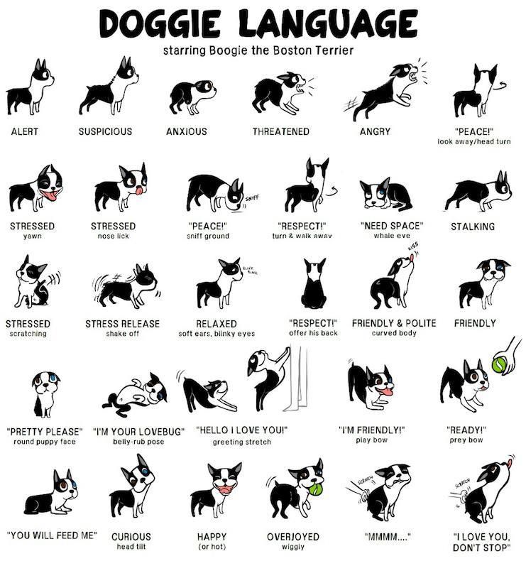
This Doggie Language chart found on Photobucket by an artist named Lili Chin is a fine example based around someone's beloved Boston Terrier, Boogie.You can see that dogs appear to be quite expressive in the way they share emotion. Every pose near enough is original and distinguishable from the next. However, let's see what happens when we look at that of a cat's...

Despite this image being quite flat and simple, we can see that the main focus of emotional energy for a cat seems to be the tail. In fact, I was always told as a child to watch a cat's tail in order to understand its mood. Now I see why. Lili Chin has done a vast array of illustrations showing off Boogie's many thoughts and feelings. Looking into emotion as well as this and doing small studies of animals (I will try with both animals and humans) as she has done will build up an understanding of character as an animator and allow for more accurate results. Knowing your subjects' actions well is a good advantage for creating deep and emotion-evoking pieces as you can then exaggerate (like she has shown below that she appears to to know her pet so well, she can make up what he is thinking) a character's emotional responses without them being too unnatural or unrelatable.

Lili's blog is a great place for all things dog-related. A great place for animation reference as it has a cartoon feel and oozes appeal! (Visit Lili's Blog - Doggie Drawings)
OUAN504 - Character & Narrative - Acting Up: Understanding Character & Narrative (Development of Cutscenes)
OUAN504 - Understanding Character & Narrative:
Cutscenes. Those fantastic little snippets of gameplay also known as in-game cinematics that give you that hands-off moment of relaxation to sit back and understand parts of a game's narrative. They are beautiful, breathtaking to look at, and are often quite different from actual live gameplay. As technology and 3D animation evolves, the rift (which I remember being very distinct when I was younger) between style of interactive game and that of the cutscenes is now slowly being closed. There is not as much of a difference as more tolerant games engines and consoles allow for equally stunning gameplay. But how have cutscenes developed over time and how do the methods used to create them effect the overall quality of the scene?

Cutscenes stereotypically involve some form of plot-thickening/forwarding interaction between characters at a pivotal point in a game. Usually you have a sense of euphoria that you've reached a major point in the game, and there are few as welcoming as the in-game cinematic. They can typically either be animated, live-action, or pre-rendered and open following a command or trigger in the game, from a video file stored in the game's files. Cutscenes don't always have to be extravagantly detailed and fully moving. For example, some RPGs (role-play games) feature just text and transitioning images to engage the player, yet they are very successful.
"Pac-Man, first released in 1980, is frequently credited as the first game to feature cut scenes, in the form of brief comical interludes about Pac-Man and the ghosts chasing each other around during those interludes, though Space Invaders Part II employed a similar technique that same year." - Arcade Museum

Cutscenes. Those fantastic little snippets of gameplay also known as in-game cinematics that give you that hands-off moment of relaxation to sit back and understand parts of a game's narrative. They are beautiful, breathtaking to look at, and are often quite different from actual live gameplay. As technology and 3D animation evolves, the rift (which I remember being very distinct when I was younger) between style of interactive game and that of the cutscenes is now slowly being closed. There is not as much of a difference as more tolerant games engines and consoles allow for equally stunning gameplay. But how have cutscenes developed over time and how do the methods used to create them effect the overall quality of the scene?
Cutscenes stereotypically involve some form of plot-thickening/forwarding interaction between characters at a pivotal point in a game. Usually you have a sense of euphoria that you've reached a major point in the game, and there are few as welcoming as the in-game cinematic. They can typically either be animated, live-action, or pre-rendered and open following a command or trigger in the game, from a video file stored in the game's files. Cutscenes don't always have to be extravagantly detailed and fully moving. For example, some RPGs (role-play games) feature just text and transitioning images to engage the player, yet they are very successful.
"Pac-Man, first released in 1980, is frequently credited as the first game to feature cut scenes, in the form of brief comical interludes about Pac-Man and the ghosts chasing each other around during those interludes, though Space Invaders Part II employed a similar technique that same year." - Arcade Museum
 |
| Yes, this is a Pac Man cutscene... |
Pre-rendered scenes are usually notorious for being the most "well-endowed" as they can make use of an array of methods to attract the audience. CGI, cel animation, and various other styles can be used to make the most of being pre-rendered. They are usually both animated and rendered by the game developers. The Final Fantasy series make use of this pre-rendered cutscenes as they were introduced in their possibly most popular Final Fantasy VII.
Live action wasn't really used that much in comparison. It definitely has a novelty about it and gives off that "retro", cheap and cheerful, often a bit kitsch feel to it. It was probably most popular in the 1980s/90s because of this effect. Some of the Star Wars games make use of live action.
Animated cutscenes can feature the use of motion capture, Machinima, and some other variations. Machinima has been especially popular recently and uses real-time computer graphics, often for fan-based animations such as Red Vs Blue (Halo spin-off), and Garry's Mod (Half Life/Team Fortress) shorts. Although there can be legal issues as fans often use popular games they have not created themselves to manipulate AIs (artificial intelligence) into a form of puppetry for comedic value, it is very well loved on the internet and can be used for a variety of purposes - just one of the many benefits to the creation of character and narrative; fan-based work using pre-rigged characters to engage in animated stories of their creation without having to have extensive knowledge of animation itself making it more accessible to the world.

Games such as Half-Life have actually done away with the cutscene altogether as Valve (the developers) see them as more of a hindrance to the gameplay than being helpful. I personally find certain aspects of cutscenes to be annoying and distracting, though I can respect them highly as an artform and would happily work on them in the future. Maybe the future of gaming is to do away with cinematography in video games altogether... We can only wait and see.
OUAN504 - Character & Narrative - Acting Up: Understanding Character & Narrative (Principles & Character Design)
OUAN504 - Understanding Character & Narrative:
Characters are by far one of the most powerful tools that bring people together, evoke emotion and create likeability and popularity for themselves. They can be as famous as some of the world's best known celebrities without physically existing and can be used as emotive, persuasive gadgets for some of the biggest companies. But how do some of the principles of animation fit into the creation of a successful character?
It can be said by many including myself that we are more attracted to characters that have large, cute, childish eyes. Eyes are the windows to the soul and can show any form of emotion in the easiest possible way. Physical exaggeration is a key part in designing a loveable hero, rogue, or creature - eyes are one of the many ways we exaggerate a character's features. In terms of animation itself, the subtle or extreme exaggeration of one's movement can determine their personality and develop how appealing they are to an audience. It isn't necessarily about having the biggest eyes or most attractive features.
"Zero", (a short animation by Zealous Creative, also the creators of "The Maker" of which I saw last year at Bradford Animation Festival) is a beautiful little animation about a voodoo doll who is an outcast in his community until he finds a partner just like him. The animation in this is really nice and subtle, and takes into account that because he is a string-woven doll, his limbs are restricted and heavy. He has a very clunky and weighty movement about him, and to me this makes him appealing. He doesn't have to go over the top with intense expressions, he is simple and fabulous.
Even this wonderful GIF from cdn.tutsplus.com is full of life and personality through using arcs! These few principles are just a some of the many ways character and narrative develops into successful animation.
Characters are by far one of the most powerful tools that bring people together, evoke emotion and create likeability and popularity for themselves. They can be as famous as some of the world's best known celebrities without physically existing and can be used as emotive, persuasive gadgets for some of the biggest companies. But how do some of the principles of animation fit into the creation of a successful character?
It can be said by many including myself that we are more attracted to characters that have large, cute, childish eyes. Eyes are the windows to the soul and can show any form of emotion in the easiest possible way. Physical exaggeration is a key part in designing a loveable hero, rogue, or creature - eyes are one of the many ways we exaggerate a character's features. In terms of animation itself, the subtle or extreme exaggeration of one's movement can determine their personality and develop how appealing they are to an audience. It isn't necessarily about having the biggest eyes or most attractive features.
"Zero", (a short animation by Zealous Creative, also the creators of "The Maker" of which I saw last year at Bradford Animation Festival) is a beautiful little animation about a voodoo doll who is an outcast in his community until he finds a partner just like him. The animation in this is really nice and subtle, and takes into account that because he is a string-woven doll, his limbs are restricted and heavy. He has a very clunky and weighty movement about him, and to me this makes him appealing. He doesn't have to go over the top with intense expressions, he is simple and fabulous.
The timing of animation is very important and can make a great difference as to whether or not we "believe" what is shown to us. If the timing is all wrong and not well thought about, it can seem too rushed and flighty, or too slow and dragged out, making the movement of a character (or object) feel jerky and unnatural. "The basics are: more drawings between poses slow and smooth the action. Fewer drawings make the action faster and crisper. A variety of slow and fast timing within a scene adds texture and interest to the movement." - Centre for Animation & Interactive Media If a character or narrative possess nice, accurate timing with variety, it is more likely to appeal to us, even if it subconsciously as most people don't really think about the principles of animation when watching a piece of animated footage.
Lastly, arcs are key to a story if the characters and objects are of a natural existence. It is true that they create popularity for animation if done nicely, but not all characters need to have well-animated arcs as robots for examples don't always move in a fluid, natural motion like the human body does. So there could be arguments both ways as the whether or not arcs are necessary for success. I think that if used for the correct objects/characters, with lots of reference used accurately, then that is all that matters.
Even this wonderful GIF from cdn.tutsplus.com is full of life and personality through using arcs! These few principles are just a some of the many ways character and narrative develops into successful animation.
OUAN504 - Character & Narrative - Acting Up: Understanding Character & Narrative (How Attitudes Have Influenced Character Design)
OUAN504 - Understanding Character & Narrative:
There is no doubt that characters' appearance, depiction, and personalities in animation have changed over the decade. Such influences as wars, politics, feminism, and race/culture/religion have all had a large impact on the way we depict and choose our characters. It would seem a no-brainer to think that "feminist culture has improved the way we see females in animation today", and that "because racial segregation has been long abolished, we'll see more non-white positive role model characters". That would be very closed-minded to think so, and sadly we still struggle with the way our changing attitudes are perceived in the industry.
One writer, Christine Hoff Kraemer, has written an article suggesting that Western animation i.e. Disney, doesn't compare well to Japanese anime in the way female role models are depicted. On her website: Christine's Really Long and Exciting Website Filled With Treasures , you'll find a lengthy explanation which goes into great detail about how anime uses female protagonists to promote awareness for such topics as the environment, which gives them instant popularity as they are obviously aiming to do good rather than the likes of Disney princesses who are aimed at young children, often a bit dumbed down in the way they act, and aren't really powerful representations at all (apart from the likes of Mulan and Pocohontas, of whom are the best represented in my opnion).
However Mulan and Pocohontas, in Disney's favour, aren't white, which is good as it shows solidarity and difference. In my opinion, many of the Disney princesses come across as a bit useless and pathetic, which says a lot about how Westernised animation portrays Westernised characters. If you take the likes of Princess Mononoke, Kiki's Delivery Service, and even Akira - all of which are Japanese animated films by Studio Ghibli, their female protagonists are all strong-willed, stubborn, and powerful in some form or another. They wear sensible clothing that is suitable for the adventure they are going on, and do not have lanky, unrealistic figures that most women do not have. It will forever bother me that most Disney princesses' clothing/appearance isn't really that suitable for kids.
One blogger, "iamnotthebatman" (click for blog), shares his opinions on many of Disney's characters. Take princess Jasmine for example: "Although her outfit generally balances out with the trousers, it is clear to see that she is not wearing a lot up top for a kids film. This fact becomes more disturbing when the realisation dawns that she is actually fourteen and suddenly her garb becomes inherently wrong. This is, needless to say, not what a young princess would wear, although the outfit is not unfit of the time. What we see Jasmine modelling is the garb of a concubine, a woman sold or traded to a man as a commodity, and an outfit most unfit of royalty. She is unmarried. She is not promised. Instead it is more likely that she would be more covered, and not depicting one of the lower level of sex servant." This is just one of many examples of Western female characters are changed to meet the oversexualised attitudes of society.
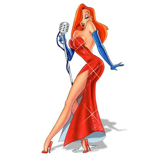
Jessica Rabbit is a notorious example of how society has allowed for characters to push boundaries. She is one of the most well-know and loved characters by men and women alike. She oozes sex appeal, which is all well and good, but the film she originates from "Who Framed Roger Rabbit" (which was released in 1998, which is relevant) is aimed at children! There was also some controversy over a split second of complete bottom-half nudity from Jessica as she stumbles out of a car. Although you may not be able to clearly notice this when played at 24 frames per second, there was a lot of outrage and it was soon recalled to be corrected.
Betty Boop (created by Max Fleischer of Fleischer studios) was also well known for being a risqué character, challenging what was seen as agreeable at the time. She first appeared in 1930 in an episode named "Dizzy Dishes" and was instantly noticed for having a rather voluptuous figure, being scantily-clad, and based on the appearance of a "flapper" girl. Some of the cartoons she appeared in were actually banned for insinuating drug use, being too racist, and of course being too sexual. If those animations were shown today - of which they are available online so therefore have been watched by the masses who seek them out - there would not have been nearly as much uproar due to changing attitudes. Although Minnie Mouse for example has plenty of footage of her showing off her bloomers and wearing a short skirt, the fact that she is depicted as child-like and innocent completely nullifies it of any sexual intention apparently. I see it as even more sinister than if she were an adult!

Somehow, I think with all nudity and objectifying in pop culture now, there wouldn't be as much fuss; but should there be? I believe that in a mere few decades, animated characters may even have the same rights to freedom as pop music videos, magazine images, and the overall disgrace celebrities are bringing to the West. Changing attitudes WILL change character development.

There is no doubt that characters' appearance, depiction, and personalities in animation have changed over the decade. Such influences as wars, politics, feminism, and race/culture/religion have all had a large impact on the way we depict and choose our characters. It would seem a no-brainer to think that "feminist culture has improved the way we see females in animation today", and that "because racial segregation has been long abolished, we'll see more non-white positive role model characters". That would be very closed-minded to think so, and sadly we still struggle with the way our changing attitudes are perceived in the industry.
One writer, Christine Hoff Kraemer, has written an article suggesting that Western animation i.e. Disney, doesn't compare well to Japanese anime in the way female role models are depicted. On her website: Christine's Really Long and Exciting Website Filled With Treasures , you'll find a lengthy explanation which goes into great detail about how anime uses female protagonists to promote awareness for such topics as the environment, which gives them instant popularity as they are obviously aiming to do good rather than the likes of Disney princesses who are aimed at young children, often a bit dumbed down in the way they act, and aren't really powerful representations at all (apart from the likes of Mulan and Pocohontas, of whom are the best represented in my opnion).
However Mulan and Pocohontas, in Disney's favour, aren't white, which is good as it shows solidarity and difference. In my opinion, many of the Disney princesses come across as a bit useless and pathetic, which says a lot about how Westernised animation portrays Westernised characters. If you take the likes of Princess Mononoke, Kiki's Delivery Service, and even Akira - all of which are Japanese animated films by Studio Ghibli, their female protagonists are all strong-willed, stubborn, and powerful in some form or another. They wear sensible clothing that is suitable for the adventure they are going on, and do not have lanky, unrealistic figures that most women do not have. It will forever bother me that most Disney princesses' clothing/appearance isn't really that suitable for kids.
One blogger, "iamnotthebatman" (click for blog), shares his opinions on many of Disney's characters. Take princess Jasmine for example: "Although her outfit generally balances out with the trousers, it is clear to see that she is not wearing a lot up top for a kids film. This fact becomes more disturbing when the realisation dawns that she is actually fourteen and suddenly her garb becomes inherently wrong. This is, needless to say, not what a young princess would wear, although the outfit is not unfit of the time. What we see Jasmine modelling is the garb of a concubine, a woman sold or traded to a man as a commodity, and an outfit most unfit of royalty. She is unmarried. She is not promised. Instead it is more likely that she would be more covered, and not depicting one of the lower level of sex servant." This is just one of many examples of Western female characters are changed to meet the oversexualised attitudes of society.
Jessica Rabbit is a notorious example of how society has allowed for characters to push boundaries. She is one of the most well-know and loved characters by men and women alike. She oozes sex appeal, which is all well and good, but the film she originates from "Who Framed Roger Rabbit" (which was released in 1998, which is relevant) is aimed at children! There was also some controversy over a split second of complete bottom-half nudity from Jessica as she stumbles out of a car. Although you may not be able to clearly notice this when played at 24 frames per second, there was a lot of outrage and it was soon recalled to be corrected.
Betty Boop (created by Max Fleischer of Fleischer studios) was also well known for being a risqué character, challenging what was seen as agreeable at the time. She first appeared in 1930 in an episode named "Dizzy Dishes" and was instantly noticed for having a rather voluptuous figure, being scantily-clad, and based on the appearance of a "flapper" girl. Some of the cartoons she appeared in were actually banned for insinuating drug use, being too racist, and of course being too sexual. If those animations were shown today - of which they are available online so therefore have been watched by the masses who seek them out - there would not have been nearly as much uproar due to changing attitudes. Although Minnie Mouse for example has plenty of footage of her showing off her bloomers and wearing a short skirt, the fact that she is depicted as child-like and innocent completely nullifies it of any sexual intention apparently. I see it as even more sinister than if she were an adult!
Somehow, I think with all nudity and objectifying in pop culture now, there wouldn't be as much fuss; but should there be? I believe that in a mere few decades, animated characters may even have the same rights to freedom as pop music videos, magazine images, and the overall disgrace celebrities are bringing to the West. Changing attitudes WILL change character development.
OUAN504 - Character & Narrative - Acting Up: Understanding Character & Narrative (Character Behaviour)
OUAN504 - Understanding Character & Narrative:
Touching on a post I made earlier about why a finalised character design is chosen over the plentiful flow of other ideas, I have decided to link that in with what I plan to explore next; how character behaviour influences the way a character looks, and how character personalities are chosen. I find it very interesting that some character appearances go "against the grain" in the way that you would absolutely not expect their aesthetic qualities to match their behaviour.
One example that springs to mind is Conker from a well-known Nintendo 64 and Xbox game "Conker's Bad Fur Day". He is depicted as a small, fluffy, adorable-looking squirrel. Every child's dream pet, right? But upon playing this odd yet hilarious game, we soon discover that Conker is not cute and cuddly at all! It was released in 2001 by Rare and THQ and was originally intended for a family audience. To contradict this, you'll soon find a heavy dose of toilet humour, sexual themes, inappropriate language, and violence.
But what made Rare (the developers) give Conker such a bad attitude? It may seem obvious with a clue in the title - "bad fur day" - but there isn't really any indication by looking at him. There are various tip offs on the cover of the game such as Conker holding a glass a beer. Other images show him smoking, holding a gun, and standing next to an anthropomorphic, sexualised rabbit (who goes by the name of Berri). Maybe the company wanted to push boundaries in terms of how characters are depicted, or maybe they had a bad day at the office and lashed out all their anger and stress on Conker!
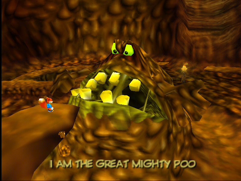
A still from one of the game levels showing some of that famous toilet humour. The "Great Mighty Poo" has a look that screams "antagonist" so is appropriate for his personality. The use of brown and dirty greens and yellows give the impression of uncleanliness and a vile set of characteristics.
OUAN504 - Character & Narrative - Acting Up: Understanding Character & Narrative (How A Character Is Chosen)
OUAN504 - Understanding Character & Narrative:
With all great ideas, there will be many initial forms of one idea to begin with. A great idea cannot simply be picked out a of a hat and stuck with throughout its developmental stages all the way to final production. The same goes for character design. Character artists may have a fantastic rough idea for a potential new project, however how many times do you think they sit there, sketching out designs only for them to be scrapped later? I went on a mission to find out what made a character's final design successful and why that design was chosen above the rest...
I talked last year in another part of my blog about how Bayonetta as a character had so many initial designs before her final form was chosen. I imagine Platinum Games (creators) had so many alternate ideas for personalities and behavioural features too. I never really explored why they went with the super-sexualised, lanky-legged, demonic-looking sass-queen, though. There were so many other potential success in designs that I thought might have been brilliant to play as in-game.
Wesley Burt, a concept artist for many games and animations such as Bayonetta, stated that she tried "westernizing Bayonetta" in roughly 2008 with the designs below taken from her blog. (http://wburtconcept.blogspot.co.uk/)
It comes to my mind that the reason these potential Bayonettas were dismissed could be due to lack of sexualisation (even though they're incredibly appealing anyway!) and overall "witchiness". Although the designs look fantastic, implying that she's a strong female character with a fairly realistic figure in comparison to the final Bayonetta, the specification did ask for a witch. When choosing from a selection of character designs, you have to bear in mind that a winning choice will just "feel" and "look" right. This will usually stem from the impression that the aesthetics will correspond to the personality. The designs above are all fantastic, but give me the impression of Bayonetta being a "bit too hardcore", more of melee-based character, and not as elegant as her more successful designs.

The Bayonetta as we know and love her definitely fits the bill of being "witchy and bitchy" with a bit more sass and attitude than the others. Her body is slender, giving the cat-like mystery we associate with witches.
OUAN504 - Character & Narrative - Acting Up: Understanding Character & Narrative (Comparison of Character Personalities)
To help me understand how character and narrative has changed over the space of roughly a century, I decided to do some research on how popular animated characters in today's entertainment industry they are portrayed now in comparison to how they were when they debuted.
For instance, Mickey Mouse is probably an obvious choice of a popular well loved character. He's the face of Walt Disney Studios and has been going strong since 1928. But how has society allowed for changes in his personality, appearance, and overall behaviour?
With just over 80 years of existence, Mickey has seen it all. He's been involved in propaganda cartoons, experienced wars, changes in politics, and seen the growth of the company he is so well known for - Disney. In 1928, Mickey first appeared in a silent short called "Plane Crazy". It didn't really rev people's engines (terrible pun intended) which probably explains why this short isn't common knowledge to be the debut of Mickey. Mickey began his life as a very basic-looking, simple black blob with humongous eyes. He also lacked the little white gloves we know and love today!

From then on, the release of Steamboat Willie came about and due its wave of popularity, it was re-released with sound. Mickey had undergone some minor changes such as smaller eyes and more elongated body. Very soon after this, Mickey finally received his gloves! He also gained another popular trademark: that cheerful, beaming smile! This small piece from Babble.com states that:
""Ub" Iwerks is the co-creator of Mickey Mouse and he didn't have just a close working relationship with Walt Disney, but the two were close friends. Iwerks was responsible for animating the early Mickey Mouse cartoons and helped to fine-tune Mickey.

By the 1940's, Mickey Mouse was very much developed! He has finally reached a point of near completion and everybody seemed rather happy with the way he looked, His personality has always been very much the same - chirpy, expressive, and caring of others - but with so many minor plastic-surgeries, The Sorcerer's Apprentice showed a fully-coloured and well-designed Mickey.
Although a relatively final design had been compromised, Mickey began to put on a few ounces of weight over the years and achieved a chubbier, cuter appearance. As technology came along with the years, so did his style as his creators played around, giving him a slight 3D look. Mickey Mouse's Clubhouse is an example of the switch to full 3D animation. His eyes have become thinner and longer and he is sporting a very modern look. (See below)

In 2013, a series of short animations starring Mickey and the gang were aired on television. Although the animation itself has a very crisp and clean look, the characters seem to go back to the older variants of designs showing the eye specular slices and thinner bodies with less complex details such as shadows and too much colour. Even the opening sequences relate directly to the past and have that "MGM Tom & Jerry" and "Warner Brothers" feel to them. With the change in society and what is deemed gruesome, appealing, exciting and so forth, I notice that the use of facial expression as changed in Mickey as many years ago, these sorts of expressions would be seen as too aggressive for children to watch. (Example below)

I think with all things in society (art, fashion, music, attitudes, and animation included), there is a constant theme of progression. However there will always be a point when homage to past is paid and past ideas are then incorporated with modern societal changes to simple add to the progress.
Tuesday, 6 January 2015
OUAN504 - Character & Narrative - Acting Up: Understanding Character & Narrative (Storyboarding)
OUAN504 - Understanding Character & Narrative:
To get a better understanding of storyboarding and some helpful techniques, I sought out a handy little blog with some interesting tips from Dreamworks animation studios. Not only do storyboards allow the artist to see their film/animation before it is actually created, it can be very valuable reference when it comes to editing and knowing which characters belong where when it comes to perspective, they are just great little treasures to have with you as storyboards and even thumbnails are those first indications and representations of an idea. They are your go-to for jotting and sketching down thoughts and processes which you can then use later on. If you have a terrible memory like myself, they are your lifesavers!
Dreamworks' cartoonist, Ben Caldwell shared with us a few cells from his storyboards and allowed us an insight into what techniques he swore by, why, what worked and what didn't work. His blog was like a goldmine for ideas too, but for now, here is what I managed to unveil.
 Avoiding flat staging means that you are thinking in a 3D perspective at all times. Using a "tight rope" floor (as Caldwell calls it) can help the artist avoid creating characters that seem to aimlessly float within a frame. It also gives you an idea of how your character will look within a given space and gives you valuable technical drawing ability as you will be repeatedly drawing different perspectives depending on your shots.
 Using every inch of the environment to your advantage will sell the idea of depth. Instead of simply thinking about what belongs in the foreground all the time, think about background and even middle-ground and far-background!
This will convince your audience that there's a lot going on and the space you have created is very realistically used by the characters. It isn't simply there to look pretty all the time, trees don't just exist to be looked at! Your characters can interact with them and react to them - more potential ways of showing off your characters' personalities.
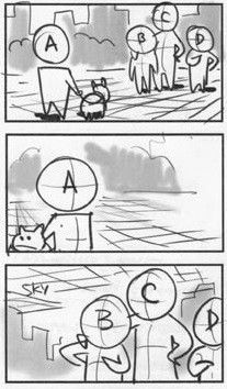
Lastly, another useful hint I picked out is that labelling your characters in a logical order - be it by order in perspective, order in who has the most screen time, protagonist and other characters etc. - it will be easier for you! If animating for example, having a character labelled "A" might indicate that they belong in the foreground for this scene. "D" might be completely unaware of what A is doing as he is in the background. All of this might sound complicated at first, but it actually makes the job easier.
Caldwell's storyboard examples have really illustrated some useful things I could improve on in the future with my storyboarding techniques. His blog; http://purgetheory.blogspot.co.uk/2012/03/storydesign-notes.html, has some fantastic advice that I will retain for future work.
To get a better understanding of storyboarding and some helpful techniques, I sought out a handy little blog with some interesting tips from Dreamworks animation studios. Not only do storyboards allow the artist to see their film/animation before it is actually created, it can be very valuable reference when it comes to editing and knowing which characters belong where when it comes to perspective, they are just great little treasures to have with you as storyboards and even thumbnails are those first indications and representations of an idea. They are your go-to for jotting and sketching down thoughts and processes which you can then use later on. If you have a terrible memory like myself, they are your lifesavers!
Dreamworks' cartoonist, Ben Caldwell shared with us a few cells from his storyboards and allowed us an insight into what techniques he swore by, why, what worked and what didn't work. His blog was like a goldmine for ideas too, but for now, here is what I managed to unveil.

This will convince your audience that there's a lot going on and the space you have created is very realistically used by the characters. It isn't simply there to look pretty all the time, trees don't just exist to be looked at! Your characters can interact with them and react to them - more potential ways of showing off your characters' personalities.
Lastly, another useful hint I picked out is that labelling your characters in a logical order - be it by order in perspective, order in who has the most screen time, protagonist and other characters etc. - it will be easier for you! If animating for example, having a character labelled "A" might indicate that they belong in the foreground for this scene. "D" might be completely unaware of what A is doing as he is in the background. All of this might sound complicated at first, but it actually makes the job easier.
Caldwell's storyboard examples have really illustrated some useful things I could improve on in the future with my storyboarding techniques. His blog; http://purgetheory.blogspot.co.uk/2012/03/storydesign-notes.html, has some fantastic advice that I will retain for future work.
Friday, 2 January 2015
OUAN504 - Character & Narrative - Acting Up: Understanding Character & Narrative (Creating a Successful Character)
OUAN504 - Understanding Character & Narrative:
We often wonder why or how we become attracted and form bonds with animated characters. Disney are just one major company that have created some of the world's most renowned personalities, melting the hearts of children and adults alike. A skilled animator or character designer must be able to evoke a number of emotions through the use of their designs. Not only must the protagonists of a narrative be appealing, but the antagonists, or villains must have the same effect.
After researching ways of putting together a smash-hit of a character, I devised some small yet interesting tasks that I think are a good idea to follow when thinking about a character. Firstly, in order to create a realistic character, you must first convince yourself that they are real. They need to have very real personalities and interact with others realistically according to their own individual behaviours.
Creating character maps are a good first port of call when your mind is brimming with ideas and you must get them down onto paper quickly. Sketches of potential features, how they walk, what accessories they may own and so forth are all appropriate things to get you started. You need to know all about your character!
Thinking of a name for a potential character is always a good way to start if you're stuck for ideas to begin with as certain names and words may give you somewhere to start artistically. It needs to be original usually in order to be appealing.
Leading character designer and illustrator, Jon Burgerman (UK-born-New York City-based artist), has some interesting tips on how to make a character come to life. This particular article from CreativeBloq was very helpful to me and I plan to refer back to it when designing:
(http://www.creativebloq.com/character-design/tips-5132643)
Deciding who your character is aimed at is always a valuable point to make as the audience are the ones who are meant to be enjoying your creations. Simple shapes and bright colours are good if you're aiming at children, whereas you can aim to be a little more complex if aiming at an older audience. A quote from Australian artist Nathan Jurevicius states that: "Commissioned character designs are usually more restrictive but no less creative. Clients have specific needs but also want me to do my 'thing'. Usually, I'll break down the core features and personality. For example, if the eyes are important then I'll focus the whole design around the face, making this the key feature that stands out."
Knowing where your work will appear is handy as you can design with that in mind. For a mobile phone screen, complex features and shapes aren't going to do you much justice as it may seem fiddly and intricate for the user.
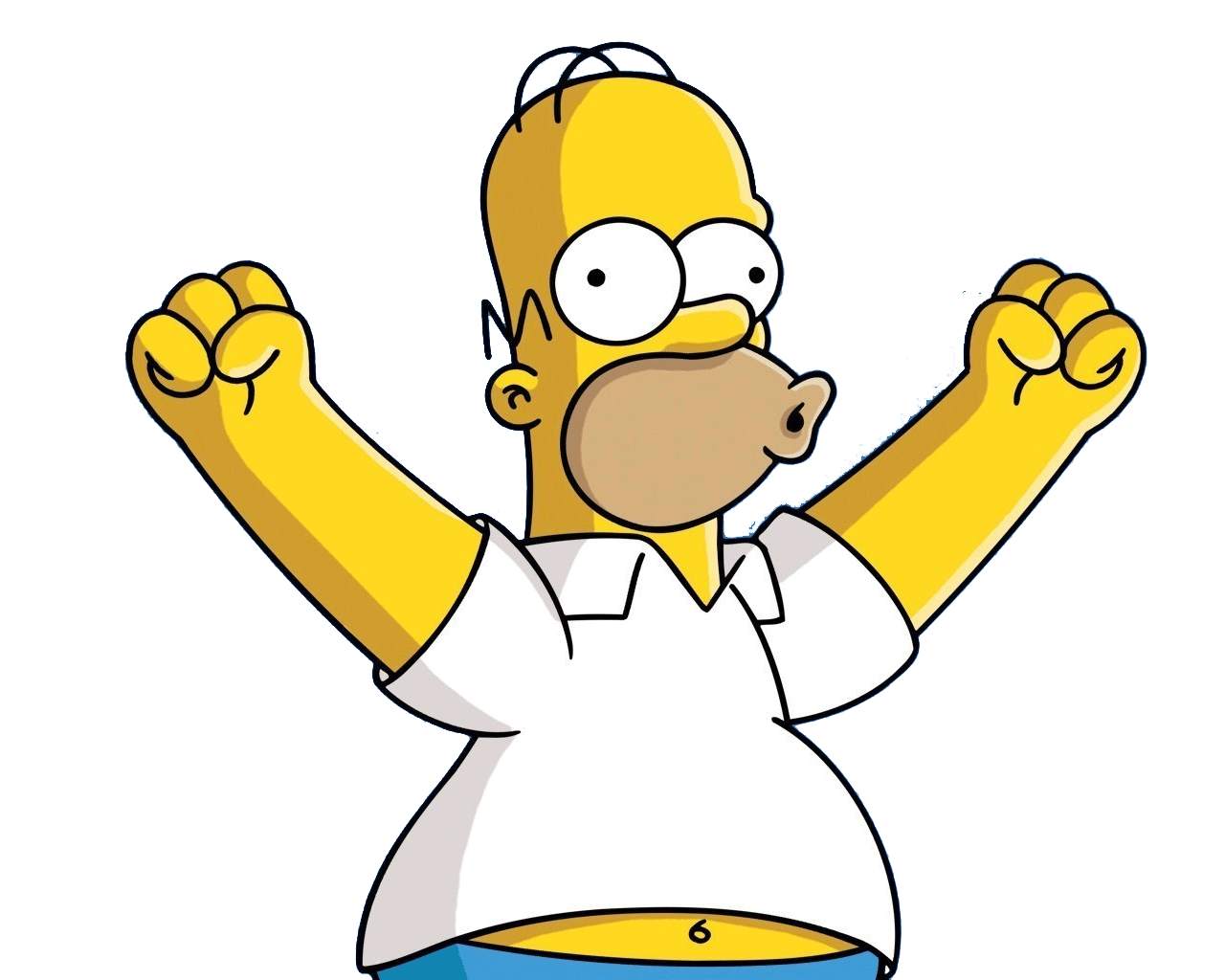
Your character need to be distinctive. Matt Groening used yellow for a reason when creating The Simpsons. We remember them, they are popular, they stand out! You can guarantee that no matter what you create, there will be a million other replicas of your character out there. Robots, monsters, mermaids, you name it, they've been done already. Thinking outside the box and applying a distinct style will get it seen.

There are plenty more things to bear in mind when creating a work of art with a life of its own. These are all great tidbits of information that I will hang on to throughout my animation degree and throughout my life.
We often wonder why or how we become attracted and form bonds with animated characters. Disney are just one major company that have created some of the world's most renowned personalities, melting the hearts of children and adults alike. A skilled animator or character designer must be able to evoke a number of emotions through the use of their designs. Not only must the protagonists of a narrative be appealing, but the antagonists, or villains must have the same effect.
After researching ways of putting together a smash-hit of a character, I devised some small yet interesting tasks that I think are a good idea to follow when thinking about a character. Firstly, in order to create a realistic character, you must first convince yourself that they are real. They need to have very real personalities and interact with others realistically according to their own individual behaviours.
Creating character maps are a good first port of call when your mind is brimming with ideas and you must get them down onto paper quickly. Sketches of potential features, how they walk, what accessories they may own and so forth are all appropriate things to get you started. You need to know all about your character!
Thinking of a name for a potential character is always a good way to start if you're stuck for ideas to begin with as certain names and words may give you somewhere to start artistically. It needs to be original usually in order to be appealing.
Leading character designer and illustrator, Jon Burgerman (UK-born-New York City-based artist), has some interesting tips on how to make a character come to life. This particular article from CreativeBloq was very helpful to me and I plan to refer back to it when designing:
(http://www.creativebloq.com/character-design/tips-5132643)
Deciding who your character is aimed at is always a valuable point to make as the audience are the ones who are meant to be enjoying your creations. Simple shapes and bright colours are good if you're aiming at children, whereas you can aim to be a little more complex if aiming at an older audience. A quote from Australian artist Nathan Jurevicius states that: "Commissioned character designs are usually more restrictive but no less creative. Clients have specific needs but also want me to do my 'thing'. Usually, I'll break down the core features and personality. For example, if the eyes are important then I'll focus the whole design around the face, making this the key feature that stands out."
Knowing where your work will appear is handy as you can design with that in mind. For a mobile phone screen, complex features and shapes aren't going to do you much justice as it may seem fiddly and intricate for the user.
Your character need to be distinctive. Matt Groening used yellow for a reason when creating The Simpsons. We remember them, they are popular, they stand out! You can guarantee that no matter what you create, there will be a million other replicas of your character out there. Robots, monsters, mermaids, you name it, they've been done already. Thinking outside the box and applying a distinct style will get it seen.
Sunday, 28 December 2014
OUAN504 - Character & Narrative - Acting Up: Understanding 3D Modelling (Insight Into Polys)
OUAN504 - Understanding 3D Modelling:
Polygons, or polys for short, are the pieces that make up a 3D model. They are the shapes that play the important role of the model's foundations and are stitched to each other by vertices and edges in order to make up the final product.
But what exactly does it mean to have a set poly count limit when it comes to professionally creating models for clients? Why do high poly counts mean slower rendering and loading times? I went on a little hunt to find out more about the polygons that make up a 3D animator's life.
This image from Fallingpixel.com is an easy way of demonstrating the difference between low-poly and high-poly models. You can see that the model with a higher count of polygons has an increased level of detail. Lower counts often look blocky and are better used for models that don't have much screen time in an animation or aren't to include much interaction in a game.

If you can find the balance between a good-looking model and a low enough poly count, then it will make matters much easier if importing into other software such as Unity as most programs have a poly limit of some description for each model or set. The image below by Matt Coombe shows that sometimes you don't need to overcomplicate things as with a poly count of 6,707, you can still create a model that looks utterly brilliant and will work much better too. Personally, I prefer the model on the left with the lower poly count as it doesn't seem too "smooth" and "perfected". In fact, there are very few minor differences between the two aesthetically, whereas the difference in polygons is astounding!

OUAN504 - Character & Narrative - Acting Up: Understanding 3D Modelling (A Brief Look into Lighting)
OUAN504 - Understanding 3D Modelling:
It may be all well and good creating a fantastic looking model, but without proper lighting, a multitude of sins can stick out like a sore thumb! I thought it would be interesting to research popular tools and methods used to give subtle light to environments for a more realistic look, harsher lights, and so forth.
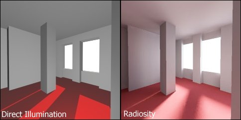
To begin, Radiosity, an illumination algorithm, is an addition to many of the render methods that exist in 3D modelling and animation. Unlike various other methods (Mental Ray and Raytrace are another couple of lighting algorithms), Radiosity is slightly unconventional in some respects as it doesn't focus on the usual method of "reflection of light ray>directly to an object>eye". It is based around the more natural idea that a ray from a light source will reflect on many objects and then back to the eye, thus allowing a mix of colours depending on the colours of the light source and the objects. This is particularly useful when lighting interior environments as walls and other multiple rooms may not be in the direct path of a light source, so it will heavily rely on the reflections from other objects. Although from Wikipedia, here is an image perfectly depicting the use of Radiosity with a comparison against another more unnatural lighting technique. Radiosity uses GI (Global Illumination) which is a way of following natural light behaviour i.e. casting rays by following realistic rules. Many renderers use GI.


It may be all well and good creating a fantastic looking model, but without proper lighting, a multitude of sins can stick out like a sore thumb! I thought it would be interesting to research popular tools and methods used to give subtle light to environments for a more realistic look, harsher lights, and so forth.
To begin, Radiosity, an illumination algorithm, is an addition to many of the render methods that exist in 3D modelling and animation. Unlike various other methods (Mental Ray and Raytrace are another couple of lighting algorithms), Radiosity is slightly unconventional in some respects as it doesn't focus on the usual method of "reflection of light ray>directly to an object>eye". It is based around the more natural idea that a ray from a light source will reflect on many objects and then back to the eye, thus allowing a mix of colours depending on the colours of the light source and the objects. This is particularly useful when lighting interior environments as walls and other multiple rooms may not be in the direct path of a light source, so it will heavily rely on the reflections from other objects. Although from Wikipedia, here is an image perfectly depicting the use of Radiosity with a comparison against another more unnatural lighting technique. Radiosity uses GI (Global Illumination) which is a way of following natural light behaviour i.e. casting rays by following realistic rules. Many renderers use GI.
Many people's opinions on internet forums seem to sway more towards Mental Ray as the choice for rendering and lighting as apparently it is more predictable. Some have argued that it is all a matter of personal preference and that the only way to truly decide on the best renderer is to try them all and do tests. I personally think that it is important to test out as many methods as you can in order to have a valuable opinion on what works for you. As a student, we have only been given Mental Ray as the renderer of choice - possibly because it is reliable - and I do wish to play with many more to get an idea of what they all do.
Mental Ray has a feature called caustics which allows a ray of light to say for instance, shine onto a wall in a room and then reflect the light onto other surfaces. "A Look At Caustics" by Jeremy Birn - http://www.3drender.com/light/caustics.html - is a very helpful guide on how caustics work in animation. Below is an image from his article showing a side by side comparison on how a rendered image looks with and without caustics to enhance lighting properties.

A Raytraced image (Left) and Raytrace enhanced with caustics (Right)
OUAN504 - Character & Narrative - Acting Up: Understanding 3D Modelling (Concepts, Principles & Limitations)
OUAN504 - Understanding 3D Modelling:
A Short History of Rendering
Way back when, early 3D models consisted of wireframe shapes that were simple representations of the everyday geometric shapes we know today. The beautifully rendered shapes and models we are able to create in this age started out with hidden algorithms. These began in the 1970's and allowed us to render curved surfaces as well as non-spherical objects.
In 1978, a wonderful gentleman named Jim Blinn who started out working for NASA creating computer graphics and animation for such things as the Voyager project. He went on to do a "simulation of wrinkled surfaces" - collgran.wordpress.com. There is a shader named after him in Maya, this is probably why as he such an influence over 3D animation.
I wish to go on with the historical aspect of rendering and 3D animation, however, it would be more practical to look at some of issues I have come across when using 3D software and certain limitations I have experiences even though I touched on them in a previous post.
Experienced Limitations
Although I haven't been using 3D software for very long and have a huge way to go in order to at least get some sense from using it, I still believe that everyone's experiences are different and we all encounter different problems.
I find that when it comes to physically creating a model or character, it is incredibly complex to use textures with them that aren't the shaders (Blinn, Lambert etc.) as creating your own textures is a completely different skillset entirely and is baffling!
Poly count. Even though we haven't got round to creating insanely complex environments or characters just yet, I have noticed that when modelling smaller environments (grassy fields with mountainous rocks in the background for instance), if the poly count is high, it can take a good while to load up and even render. There has to be a compromise between quality of model and poly count as larger poly counts can mean in-game crashing if to be used for such purpose and long loading times.
The size of the files created when using 3D modelling is immense and can often lead to issues with inadequate computer space or processors. Not all animators are wealthy and having to fork out on the latest in computer hardware can be a bit of a setback.
OUAN504 - Character & Narrative - Acting Up: Understanding 3D Modelling (Tomb Raider - Evolution & Motion Capture)
OUAN504 - Understand 3D Modelling:
In terms of how far 3D animation has come as a process, I think it would only be fair and logical to talk about how the popular Tomb Raider games franchise has improved over the years. I remember playing one of the first Tomb Raider games when I was a toddler, and although being a toddler I couldn't make comment on the technologies of the time, I did think it was an amazing game as I simply couldn't put it down!
Tomb Raider has had a lot of stick though due to feminists screaming "exploitation". Though this hasn't (thankfully) affected the way Lara Croft has been developed as a character. This little gem was found on the website Fanpop (see image below) showing the fantastic evolution of Lara Croft over the past couple of decades since it was first released on Playstation One in 1996. I think it is phenomenal to show the changes she has undergone.

The new Lara looks much more realistic and conforms to a more natural-looking female body shape in comparison to the 90's Laras with breathtakingly thin waists and exaggerated proportions. The advance in 3D technologies is very obvious in this image and has allowed for better clothing texturing, lighting, smoothness and complexity of body shapes, and many other features. This isn't just a feature of the Tomb Raider franchise however. I plan to explore the growth of design and modelling within other animation later on in my blog.
Lara Croft's animation today is undergone using the performance capture method. Early techniques of motion capture (performance capture) were done using many cameras in order to calculate the object or person's positions within a space. There are various advantages that come with using motion capture. Some of these are as follows:
Rapid, real-time results can be accurately captured.
Traditional techniques such as 2D or stop-motion can vary in intensity of work and complexity.
Secondary animation, exaggeration, and subtle movements can be easily caught.
In contrast, the disadvantages are:
Expensive to acquire suitable software and hardware.
Specifications in order to use hardware and software vary such as capture space etc.
Unnatural movement is hard to replicate as you cannot really tamper with captured movement.
Added emphasis and unnatural movement (linear/robotic/overexaggerated) is easier to achieve with other methods.
I am actually very thankful that Lara's chest is no longer triangular in shape as it may have given men unrealistic expectations of what women should strive to look like. Thank technological evolution for allowance of more polys and better software! (Apologies.)

OUAN504 - Character & Narrative: Modelling Props (The Stars)
OUAN504 - Modelling Props:
For the very last scene of my animation, Moom is shown spinning around amongst falling stars whilst holding a T-pose. It is supposed to look like he is revelling in the falling stars and enjoying the fact that he is an "all star". I wanted to make the stars look very unrealistic and basic. I looked at many images of different types and shapes of stars and after playing a little "reference gaming", I stumbled upon some brilliant stars that would be very fitting for the animation.
In fact, I was playing the Playstation One game "Stuart Little" and saw the stars floating around in one of the bedrooms. They were bright, cheerful, very slightly 3D (the stars are only to be seen from the front view so making them too complex would be pointless), and had little shadow on them.
After creating a prism shape, I pulled in some of the vertices to give it the five-pointed star shape and puffed out some of the faces and vertices to give depth. I added some lighting to see how the light would fall and how the shadows would be cast and was very happy with results. I didn't want them too dramatic as it might detract the attention from Moom.
OUAN504 - Character & Narrative: Modelling Props (The Onion)
OUAN504 - Modelling Props:
Despite me thinking my modelling was alright for an amateur, this character in particular really threw me off guard. The onion, the character of which Moom is seen interacting with during the first scene or so wasn't exactly a demonstration of my "improving" Maya skillset. Not only did I find it hard to model, but texturing was unbelievably difficult!
The shape of the onion and the cute expression reminded me of a mob from an online game I played back in the day called Fiesta. The mob (group of monsters of which you played against) was a group of things called Slimes. I thought my onion vaguely resembled one of these. (Image below)


I used a simple image of a licence-free onion found on Google to use for the texture as I wanted to show the streakiness of the onion's layers. I did try a simple Lambert texture and used a vague onion-like colour, but without the added detail of the onion skin and many layers underneath, it looked more like a brown excrement than an onion...
However, the face of the onion went better than expected and I still achieved the "gormlessly cute" and vacant look of which I was after. So despite the horrid onion shape (I watched many tutorials and studied other 3D onion models without prevail), I managed to model at least something. I may try again if I have time as I can't possibly make the same mistakes twice (hopefully).


Despite me thinking my modelling was alright for an amateur, this character in particular really threw me off guard. The onion, the character of which Moom is seen interacting with during the first scene or so wasn't exactly a demonstration of my "improving" Maya skillset. Not only did I find it hard to model, but texturing was unbelievably difficult!
The shape of the onion and the cute expression reminded me of a mob from an online game I played back in the day called Fiesta. The mob (group of monsters of which you played against) was a group of things called Slimes. I thought my onion vaguely resembled one of these. (Image below)

Or maybe even the Slimes from Dragon Quest?

I used a simple image of a licence-free onion found on Google to use for the texture as I wanted to show the streakiness of the onion's layers. I did try a simple Lambert texture and used a vague onion-like colour, but without the added detail of the onion skin and many layers underneath, it looked more like a brown excrement than an onion...
However, the face of the onion went better than expected and I still achieved the "gormlessly cute" and vacant look of which I was after. So despite the horrid onion shape (I watched many tutorials and studied other 3D onion models without prevail), I managed to model at least something. I may try again if I have time as I can't possibly make the same mistakes twice (hopefully).
Tuesday, 16 December 2014
OUAN504 - Character & Narrative: Modelling Props (The Basketball)
OUAN504 - Modelling Props:
This was incredibly difficult at first despite it being a mere basketball. The reason for this was that I didn't want to apply any more images onto my models as textures as I thought they were starting to look a little shabby and without decent knowledge of texture application, I decided that it was best to stick to good old Lambert and Blinn by applying simple shaders.
This meant that rather than creating a simple ball and making it orange with black lines, I had to create the grooves on the ball by using a few tools that I had never touched before. A useful tutorial on YouTube (below) was a great method of learning this new tool of which was not available on the toolbar so instead I had to manually type the name of the tool into the command bar to select it. This tool was the "Interactive Split Tool" which allowed me to get the grooves on the basketball into a rough position on the ball. After smoothing the ball, they fell into shape.
After finishing this model, I agreed it was by far the easiest I had made. Here is my finished product.
Subscribe to:
Posts (Atom)