Creating a Texture Portfolio
To begin the next part of my research, material play and testing, I would need to find some suitable textures that could be manipulated and played with in After Effects to give the effect of a "Little Big Planet" world. These would need to be soft, fluffy, not too heavy. and brightly coloured (although some could be edited) to achieve this).
I started out by looking on free stock image websites that supplied free textures for use in personal projects and videos, so long as credit to tjhe site is given. I found this lovely site: TextureMate
The site featured all kinds of realisitic textures, though many of which were not suitable as they were far too "grungey" and miserable-looking.
If I need a special kind of texture, I plan to take photographs of interesting textures I find out and about, for instance, the bark of trees, different cloth textures, floor tiles, even grass! Anything bright and dynamic will be useful.
To prove that all these textures are acceptable for use in my project, I took a little look at artist's info:
Below is an example texture from the site above. I like the roughness and dynamic feel it gives, so I may use this in my testing pieces to see if it works. I will also try changing the colours around a bit to see if I can make it a little more cheery!


The Decision
After much playing around with other people's pre-scanned textures, I didn't feel that any of them were really what I was after and didn't give the exact texture I was looking for. I went to the local market, hunted around my flat, and borrowed found materials to scan in and use as overlays in Photoshop. The look I was aiming for was slightly textured paper. Enough to make the shapes jump off the screen, but not too much to detract from the fact that the animation will be 2D pieces. I was after that cutout aesthetic and felt that online free textures weren't really doing it for me.
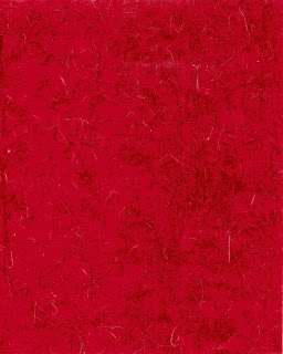
Here are some omy final few textures that I will overlay in my animations:


No comments:
Post a Comment