Saturday, 22 February 2014

OUAN406 - A Tale in The Sting: Colour Theory

OUAN406: Colour Theory:

In the process of choosing particular colours for each of my idents to suit my target audience, or rather the target audience of each channel, I decided that it would be a wise idea to look at colour theory in order to make my choices more informed. Firstly, I thought about what colours would attract children for the Cbeebies idents. Warm, bright, happy colours came to mind as these would gauge the most attention in my opinion. E4 would benefit from bright, deep and shocking colours such as purples and pinks (also would work well with their logo). As for the Discovery channel, greens, browns, earthy tones would be successful as would greys and metallics shades (science, cold).

http://www.colormatters.com/color-and-design/basic-color-theory

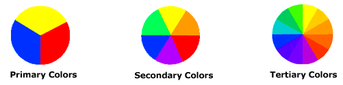
Colour Matters is great website that I came across informing me about the basic colour theories I learned way back in primary school. It was a nice refresher to see how colours compliment each other and how some don't go together at all. There are obvious patterns to choosing the best colours thus making it easier for me in the long run.


The main categories on the colour wheel are shown above. http://www.resene.com/homeown/use_colr/coloursforliving.htm is a great website I found that looks at how colours affect children. Although this site focuses on colours in the home and bedrooms in order to calm children etc. I found that it was particularly helpful in helping me understand colours and their effects.

Pastels and soft colours tend to be more calming and soothing giving the feeling of love to children who are exposed to these colours for a long period of time. Bright, primary colours are seen to excite children in small doses - can be healthy if the aim is to stimulate their brains. However, in large quantities, primary, bold colours can be unsettling along with geometric patterns.

Muted colours considered beneficial
Resene MingResene DroverResene Golden GlowResene Mexican RedResene Milk PunchResene Chetwode Blue
 
      
Resene Puerto RicoResene SungloResene Tacao

I plan to use Drover and Golden Glow-type shades for my lion, Giraffe and Monkey. Similar colours will be easy to focus on, not causing too much distress. These neutral, warm, earthy colours mixed with some green for the grass and background will work very well. 


Uplifting bright colours
Resene CranberryResene Deep KoamaruResene Flame RedResene LimaResene Moon YellowResene Resolution Blue
 
      
Resene SalemResene West SideResene Windsor
In order to stop my ident from being too calming and essentially losing its "excitement", I think Moon Yellow tones and West Side would be good shades to use. Obviously, these may slightly differ in my ident but using these charts as a guide is proving helpful. 

Distressing colours for my E4 ident would be useful as I plan to make the ident gaudy and very "in your face" anyway. Bright, clashy pinks and purples would be suitable. I plan to also use muted and earthy/grassy tones for the Discovery ident too.


Friday, 14 February 2014

OUAN406: A Tale in The Sting: Informing Style (Discovery)

OUAN406: Informing Style:

In terms of style for the Discovery channel's Ident, I decided on a fairly realistic style for the animal I would choose to run across the screen. Discovery, although have an eye for humorous yet informative entertainment, have a range of fairly serious programmes, therefore I felt a realistic style would be appropriate. If I used heavily cartoon-styled animals and scenery, I feel it would not cater to the target audience as much as although children/teens do watch this channel, it is not primarily teens as the target audience and although this could be argued against as my E4 ident is extremely cartoony, they're entirely comedy based whereas Discovery is not.

If it is possible, I feel that rotoscoping some parts such as the animal sprinting through the air would benefit me as not only would I learn how they behave and learn about secondary animation, arcs, and timing, I feel that it would save a little bit of time as I do have two other idents to accomplish. If I can get away with drawing from reference alone without rotoscoping then I would prefer this method.

My ideas on animals ranged from a rhinoceros plodding across the screen, a lion fleeting whilst its mane will have a beautiful follow-through animation, a bird fluttering in the grass, to a leopard or a cheetah sprinting. Eventually, after weighing up the pros and cons of each animal, I decided on a cheetah as not only are they graceful when they run, they are fast (a frolicking cheetah would be fun to watch) and suit the terrain (grassy savanna) well. I had to be fairly accurate with the setting and the animal. I did want to use green grass, but the savanna is very hot and therefore there would be very little green grass as we know it in the UK. Yellow, dry and "rustly" grass will be used as this is more accurate.

Cheetahs have fairly short fur in comparison to most big cats. Of course, in a hot climate short hair keeps them cool through the day and warm on the colder evenings. It would be easier to animate compared to a lion's flowing mane or a bird's fluttering individual feathers. I don't want to give myself a huge task. If I could focus my attention on just one ident, I would consider other animals. Cheetahs are quite slender though, so the texture of the fur won't need to be too complex.


Above, a photograph from National Geographic showing a cheetah in mid-leap. Notice the short tufts of fur on the under belly with short fur elsewhere. The tail is thick and sleek. I may add rougher, hairier textured brush strokes around the belly.


Monday, 10 February 2014

OUAN406: A Tale in The Sting: Informing Style (E4)

OUAN406: Informing Style:

For my E4 ident, I am very, very intent on using an anime (Moe) style for this ident. Anime is my preferred style yet I haven't had the chance to use it once in any of my previous projects. Considering this ident is for E4, what better place to use it than now? The exact style I wanted to aim for (anime is a very broad genre, it reaches way beyond the stereotypical style of schoolgirls and overly-large breasts) was moe. Moe is basically overly-cute, overly-cheesy and usually quite shallow in storyline as in between all the cheeky shots of panties and bras, there usually isn't much to look at as it's usually just a bunch of clumsy girls falling over and acting "cute".

I wanted to create a character with this personality as it would really work as a mic-take of the stereotypical Japanese popular culture. By making her a clumsy warrior, it would add humour and appeal. In terms of style, a mixture of Princess Robot Bubblegum from GTA IV, Sailor Moon, elements of Panty & Stocking With Garter Belt, Cardcaptor Sakura, Tokyo Mew Mew, Madoka Magica and Senpai Club.

Moe as a subgenre is the stereotypical anime style you see plastered all over Japanese billboards and subway posters, usually aimed at older men as a style as it's purely eyecandy and fanservice for seedy men who love looking at women that take the form of younger girls. "Lolicon" is very similar in style and morals. Here is an example of both Moe and Lolicon.


Found on silverparfait.blogspot.com
The idea of a cute girl with a weapon fighting off giant monsters is a very popular and overly-used storyline in Japan of which I want to use as a parody for my ident.

In terms of character personality, I was thinking of conforming to the "Lolicon" subgenre of anime, which is very similar to Moe in the sense of art style and narratives, as Lolicon anime usually features older girls with very young personalities, often relating to the clumsiness and cutesy-cutesy stereotype.

Note the incredibly cheesy opening title sequence, this is also a parody and one I hold close in terms of reference as I want achieve something similar to this. 

OUAN406: A Tale in The Sting: Informing Style (Cbeebies)

OUAN406: Style:

In the process of looking for a particular style for each of my idents, I came across images and videos that would perhaps portray a better picture of what style I have chosen to do my idents in. These will later inform character designs.

For my Cbeebies idea, I had the style of cut-out paper characters in mind and for process, a stop motion animation could work and look more crafty and child-friendly. Scissors and other bits and bobs could be shown on screen around the edges to add to the authenticity. I quite liked this image from flutterbydesignsaz.blogspot.com


I had the idea of putting split pins through the joints for smooth, sturdy movement but after some thought about it, I thought simply cutting the limbs off the animals and placing the limbs over the body and adjusting them each time was a better idea as it would look more "seamless" compared to massive, chunky split pins taking up most of the animals' bodies. 

I watched a really nice animation with a fellow animation student of whom sent me the animation from Vimeo. It demonstrates a good use of this technique that I would consider using (cutting out the limbs and placing on top in layers for smooth, seamless movement). 


Giangrande - Paper Plane (Official Video) from gianluca maruotti on Vimeo.

OUAN406: A Tale in The Sting: Channel History

OUAN406: Channel History:

E4 was launched on January 18th, 2001 as a companion channel to Channel 4. The "E" signifies entertainment and its primary target audience are the 16-35 (approximately) age range. E4 focusses heavily on American comedy (most of which isn't really that funny...) which would appeal to a indie/culturally-modern audience. E4 also show rather popular British shows such as "Come Dine With Me" and are often known (My family often make many jokes regarding this) to re-repeat many shows such as "Friends" which is long-gone and "Big Bang Theory". It has gained the title within my social group as "The Big Bang Theory Channel" as you can guarantee it'll be on the moment you flick over to E4! E4 Radio is also part of the Channel 4 range of channels and More 4 is another example.

Cbeebies was launched in February 2002 as part of the BBC group and has a target audience of children 6 years and below. It encourages safe play and learning within an educational environment and has a good reputation by being not only part of the BBC, but by broadcasting channels that are incredibly child-friendly and simple. Parents can trust Cbeebies because of this. CBBC is basically the "older variant" of the channel, which has an age range of around 6-12 in audience. Their shows include "The Tracy Beaker Show" and "The Sarah Jane Adventures".

Discovery channel was launched in 1985 and was formerly known as The Discovery Channel, now referred to as Discovery for easiness, is mainly an American-based channel that features shows such as "Shark Week", "How it's Made" and "Deadliest Catch". They have a large audience of a range of ages from many different countries. They broadcast in several languages and have the goal of informing an audience whilst being entertaining at the same time. Their Shark Week stunt boosted ratings heavily and they continue to broaden their audience by incorporating more programmes dedicated to occupations and machines as opposed to just animals and nature.

OUAN406: A Tale in The Sting: What has Informed My Ideas?

OUAN406: What has Informed My Ideas?

Cbeebies has a very strong consistency of using the little, yellow blobs in each of their idents. I wanted to break free from this as I felt it was overused and although it may seem popular and well-loved by many children, I feel that something equally as appealing could replace these blobs. Something with more character and more emotion, not just a bunch of blobs bouncing around randomly! Cbeebies' idents informed my decision of changing the use of the blobs and going for a shared interest in all children: animals and wildlife.

My E4 ident was again, informed by their previous idents. I browsed their site for idents that won their annual competition and the ones that didn't win, the reasons why maybe they didn't quite make it and the reasons why the winners' entries were so strong. The strengths of all the winners were that they were hilarious, innovative, fun and just plain crazy! E4 like creativity by the looks of it, and I planned to use popular culture to benefit me (for once!) by using an anime style with cheesy attacks and a big E4 monster! Godzilla may have a vaguely informed by decision of the narrative as the ident in general is Japanese-themed and the idea of a giant monster ravaging through the city is probably connected to Godzilla in some way. I may watch clips of Godzilla as reference.

The Discovery ident ideas were informed by their content on the channel: wildlife, nature, animals, adventure. By featuring an animal (yet to be decided fully) going on a brave adventure across the screen filled with tall grass then finally pouncing on the logo (its prey), I would be relating the ident to their programmes and feel it would be a good representation of their channel instead of merely confining the ident and animation to the sphere/logo and not allowing any animation to roam the rest of the screen. By including the logo actively in the narrative, it would seem fun and friendly and not completely serious.

OUAN406: A Tale in The Sting: The History of Idents & Chosen Channels

OUAN406: Historical Research:


After searching the internet meticulously for the oldest known ident in the history of television, I managed to find the most ancient of idents made for, of course, the BBC. The first television channel in the world was called WRGB, which started broadcasting in January 1928. However, this television channel didn't actually have an ident!

I discovered that the BBC's ident was very simple, following a graphic design style and was first broadcast in 1953 up until the early 60s. At first glance, it does look rather random with its flashing wings, magical jingles for sounds and rotating rings around a small sphere. However, it's actually very clever in the way the the rings move to line up with the sphere to look like an eye thus relating very well to the BBC's purpose as a channel - to be viewed. The flashing wings look vaguely like radio signal waves with lightening bolts coming off them which is also appropriate. I think it's a very successful ident and set the bat for many years as to how other channels identified themselves.

BBC's first ident is actually very similar to that of ATV's in 1969. It follows the same theme of having an eye or eyes watching the audience. Only up until the 2000s did idents start getting incredibly wacky and creative with YTVs range of alien characters and goo used to promote the channel. Goo and slime seemed to very popular when I was child watching TV probably because of the sheer gross factor that kept kids interested and parents disgusted!

The BBC also had a very similar ident which featured a clock, which relates well to their news being broadcast at a certain time.


Wednesday, 5 February 2014

OUAN406 - A Tale in The Sting: References

OUAN406 - References:

For the E4 ident, I plan to look at the way anime as an animation style is created. How anime animators get their characters looking so fluid with those clean, crisp lines and cel-shadings. I will watch references that also perform mockeries of Japanese otaku culture such as Princess Robot Bubblegum parodies from GTA IV. I will also use reference when creating my characters and plan to base them around cute, maid-like warriors such as those from Tokyo Mew Mew or Cardcaptor Sakura. I will also watch more E4 idents to see if there is a possibility that I can make my logo more 3D looking as he needs to look gargantuan in comparison to my female warrior. I will also watch anime where beams of light are being shot. Dragonball, Naruto, Tokyo Mew Mew and maybe some video games such as Tekken would be good reference for this.

For the Discovery ident, I will obviously need to look very carefully at how lions move, run, pounce and attack their prey as this will be the predominant bit of animation in my ident. I will need to observe how leaves flutter when they are thrown into the air, such as when a pile of autumn leaves are jumped into by children. I will focus on the way grass sways in the wind, also. I already have fair knowledge on how pendulums swing when hit by a force, but a little more learning about them won't hurt my animation.

Lastly, the Cbeebies ident will require me to look at how animals creep up on their prey whilst in hiding. i will study how animals walk and will have to look at a few considering I will choose to animate at least three animals. I also need to observe how my chosen animals sit and perform small animals characteristics like scratching themselves and twitching.


OUAN406 - A Tale in The Sting: Work Plans

OUAN406 - Work Plans:

After choosing which brief I would like to have a go at, I decided that it would be a wise idea to create a rough work plan of which I should try my best to adhere to. I made a plan in my last module but didn't follow it 100% and sometimes got a little carried away with the holiday break by going into hiding and enjoying my creative slump...

I fully understand that this should help with my time management and will do my best to follow this plan as a ritual in order to get my idents finished in good time with enough room for improvements.


Monday, 3 February 2014

OUAN406 - A Tale in The Sting: Discovery Initial Ideas

OUAN406 - Discovery Channel Ideas:

This was probably the hardest solution I had to solve out of the three that I chose yet I stuck by it as I wanted a challenge and although I could have a little bit of humour in the ident as Discovery Channel is fairly laid back, it was still going to be difficult and is completely different to that of the other two.

One of my ideas was to stick to the theme of having the orbiting "D" logo with some kind of animation in the middle of the sphere. I thought maybe something majestic and epic such as a leaping cheetah or galloping gazelle running towards the viewer/camera would be a nice little idea. The background could consist of raindrops running down the screen with a blurred filter on top so that the audience wouldn't be too distracted from the foreground and logo.

Another idea was that a lion would pop its head out of the grass that surrounded the bottom of the screen and as the grass rustled, the lion would pounce out of the grass, run across the screen with its mane flowing in the wind and jump into the patch of grass at the right hand side of the screen. The discovery logo would swing from the top of the screen in the breeze and the lion's paws would spring out of the grass in an attempt to catch the logo in the air. After a few swipes at the logo, the logo would fall from the string/rope holding it in the air and crash into the grass below sending leaves flying into the air.

My last idea was that the Discovery logo could take up the majority of the screen and the D would spin around the sphere like their current idents. Then, the globe would turn into a camera lens almost (i'd prefer a fish-eye lens to add some depth and make it more interesting to the viewers) and a bird would swoop down with its wings flapping steadily and land on a perch out of view from the lens and pop its dangling head into view and look curiously through the lens audience. It would then prepare for take off and fly away after a few seconds. There would be swaying silhouettes of trees as the background with an orange/pink hue to give the look of a sunset in the Sahara.

I wanted to stick with a natural theme as Discovery focus heavily on nature and animal documentaries. Although they make various other shows, I think a natural theme would draw the audience in as let's face it, everyone loves animals of some description. It would also be child-friendly as if I used a cold-hard scientific theme with plenty of greys and silvers, it wouldn't really be as eye-catching and fun.

I stuck with the idea of a lion character rustling in the grass and then pouncing into the grass to catch the Discovery logo. It seemed fun, light-hearted and would allow me to watch reference videos and observe how lions pounce, move and sneak up on their prey.

OUAN406 - A Tale in The Sting: Cbeebies Initial Ideas

OUAN406 - Cbeebies Ideas:

Cbeebies, albeit fun and silly (a style that I love) was a difficult one to process ideas for as it took me a while to think of something that would be suitable for young children but also engage them quickly in the ident. Bright colours and a fun story are all fine and dandy, but if you lack appeal it can fall through and possibly mean nothing to the audience. I had to find a way of using the same sort of appeal Cbeebies used for their idents.


Their current mascots if you like, are the jiggly yellow blobs that seem to be able to morph into any shape and mould themselves appropriately into a shape depending on the occasion. At Christmas, I remember that they could transform into trees and candy canes and bounce up and down while being surrounded by falling snow. This is a very simple way of gaining attention from the little ones. I'm personally not a fan of the big, black outline that the characters have surrounding them. I suppose this makes them easier to spot and follow on the screen, but if I were to engage a very young audience, I'd want to start with something softer and less harsh on the eyes.

In order to do this, I thought of various ideas. My first was to have a theme that most children would find appealing and yet be educational to an extent as it may something that kids can identify with. That theme was animals. I thought about have a small, green bush in a bright jungle/plain background so not to draw attention from the foreground or make the ident too busy, and make it rustle a little bit. Then, "cut out" looking lions, tigers, bears and other animals would crawl out from behind the bush smiling with large, beady eyes. The logo would then wipe across the top of the screen to resemble a sort of rainbow. The animals would blink sweetly and tilt their heads.

I really like the first idea and more could be achieved from using a theme that has a mutual connection with children. Another I thought of was to use a spaceship/UFO/flying saucer flying across the screen and wobbling from left to right in its path. It would then stop and drop an alien from it's trapdoor onto the floor of which will hold the logo. The background again would be very plain as not to distract attention. I could make a few little stars to scatter across the frame to set the scene. Boys would especially find this interesting as it has the potential to be gross and "gooey" looking. I wanted a more gender-neutral idea though.

The third idea I had was to have a cute little ice skater or dancer spinning across the screen, again in a cutout style to give it the softness that a girl's animation would be associated with. She would spin and dance as the logo fades in as she holds a pose at the end. She would maybe wink or blush to add to add a touch of fun. A pale, pastel coloured background could be used whereas the character would be bright and eye-catching. I still thought a gender-neutral animation would benefit Cbeebies more in terms of audience ratings.

I was very very fond of the animal idea and think it is simple enough and appealing enough to work with all children. I will expand on this more and research into styles, animation techniques and so forth.

OUAN406 - A Tale in The Sting: E4 Initial Ideas

OUAN5406 - E4 Ideas:

After much thought about how I could create something quirky and entertaining that would easily promote E4 and make them out to be "awesome", I decided on some initial ideas and what could happen in the small amount of time I had. I had ideas such as a man falling in love with a giant E4 and taking it on a romantic meal then at the end, a velvet red curtain would drop down and leave the rest to the imagination. This lacked the "punch" that I wanted; it simply wasn't fun and action-packed enough.

Secondly, I thought of E4 as a monster, ravaging through a city, eating buildings and treading on everything in its path before finally grabbing the camera (the viewer) and swallowing it whole allowing the camera to fade to black showing the logo at the end. Still, action packed and humorous and possibly had the potential to appeal to the audience but still lacked the whole "popular culture" aspect I wanted to welcome to the ident.

Another idea was to feature aspects of social media and networking. Those horrid hashtags from Twitter that everyone keeps using combined with the typical "Wayfarer" glasses, maybe an indie band playing in the background with Tetris blocks and other bits of mumbo-jumbo floating around in the foreground could work, I mean, at least it would appeal to one variant of the audience even if it's not exactly the image I would like to give E4... The drum kit could feature the logo, maybe pop out of the drum at the end and burst through the screen? I wanted almost a mic-take of our youth, our generation of mass media and terrible music.

Then! Huzzah! An idea to end all ideas that could give me the element of humour, popular culture (that the UK and USA would understand) and a slight mic-take of our culture by using over-exaggeration, silly voiceovers and super powers was born. I finally decided on creating an overly-cute Anime character with candy floss hair that immediately defied the laws of gravity, wearing the epitome of superhero fashion disasters, holding what can only be described as the most unthreatening-looking mace/staff ever. I would keep the idea of the E4 logo being a ravaging monster, but instead, my "Super Kawaii E4 Girl" would fight this monster and obliterate it with her mace in a flash of light. Not only would it be super funny and cute, not to mention cheesy, it would give my ident that "punch" that I wanted. I plan on developing this idea further.

I will research some of Kerrang's idents as I remember they did a Power Ranger's styled one that featured a very similar idea of using a beam of light to defend themselves. I may use this not only to see how other channels do their idents but to get animation tips to aid my own.

OUAN406 - A Tale in The Sting: Researching Idents & Channels

OUAN406 - Research:

After a thorough scouring of E4's, Cbeebies' and Discovery Channel's websites for idents they have previously used and are currently using, I noticed that they catered to their target audiences very well. I also had a look at BBC Four's website and noticed that they are indeed a very refined and sophisticated channel with high-end documentaries and very informative and factual news programmes. Their idents also very much conformed to this image as they feature(d) rather lovely photographs of birds flying, waves lapping a beach, flowers blooming and many other natural idylls that depict beauty and knowledge.

I also spotted one set in a library showing a child reaching for a book as the ladder moves and almost teleports her to another part of the bookshelf. This overall theme of information and nature is pretty much what the BBC is all about and didn't appeal to me half as much as the other three as I felt I was restricted more so than the others in terms of what I could do for the BBC. Cartoons aren't usually associated with the refined and older generations as it is a fairly modern practice. In order to create what I would like for the BBC, I would probably have to turn to such methods as pixilation or a method using photography as this to me seems more plain, simple and can focus on the reality of the world around us more successfully.

Cbeebies' idents were very much child-oriented (which would seem a no-brainer!) with their bright colours, fun sounds effects, happy, smiling faces, and cute characters. Their signature character seems to be (in the past decade anyway) a little yellow blob with about the same consistency of morph (bouncy and fun), sporting a cute, exaggerated face. This would instantly grab children's attention and this is probably done through the use of bright colours and an appealing character in general. Including a face on character aimed a children is a wise move as children can identify with a face, especially if exaggerated motion and facial expressions play a part in the character's makeup, and young children who may not completely understand the concept of expression yet can learn through the character. The soundtracks used for idents on Cbeebies were overall very upbeat, happy and "bouncy". Lots of noise keeps kids interested and if you can keep a child interested during an ident then there's a fair chance they'll want to watch the following programmes thus increasing channels' ratings and viewings which in turn makes them more successful as a company.

Discovery Channel's idents were very simplistic yet interesting at the same time. Their most recent idents feature a spinning "D" (their logo) which happens to be rotating around a spherical globe (another part of the logo) containing an image or short video clip of the following programme. They use very cold, mechanical colours to represent some of their channel's content (machinery, science, vehicles) which wouldn't really bother their audience as they have no purpose in keeping the likes of 2 year olds' attention spans. There's usually lots of slow motion clips shown in the ident with the purpose of making something usual seem incredibly interesting and unusual. The channel's purpose is to show documentaries based around machines, nature, science and all round knowledge. Unlike BBC Four, Discovery takes a rather fun and hands on approach to their programmes which makes their target audience slightly broader in comparison. Teenagers such as myself will find them fascinating as the likes of Bear Grylls' documentaries look at how things are done in first person making them action-packed and vibrant unlike the BBC who simply narrate in a fairly monotonous way to a series of pre-filmed clips.

E4 on the other hand is aimed at a broad range of people. 18-35 year olds are seen to be their audience and the reason for this would be as E4 say: "It provides bite-sized entertainment for the social networking generation" (e4.com) They are very much the modern twin of Channel 4 and allow for multi-platform entertainment (content available on xBox, PS3, PS4, xBox One etc.) which would be sought for by a younger generation. They feature American comedy and dramas heavily on their channel and to me come across as a fairly "indie" channel as they do things a little differently to the likes of most channels. They're not afraid to advertise using abstract methods, showing things from popular culture, retro memorabilia, blasts from the past...

OUAN406 - A Tale in The Sting: Idents

OUAN406 - Idents:

After receiving the brief and given three out of four potential choices (channels/clients) to create animated idents for, I chose the Discovery Channel, CBeebies and of course E4. I chose this brief over the other two as I did not plan on conveying emotion through deep topics such as child abuse, third world country problems and so forth.

I personally am not a massive fan of campaign ads as I find that you can't really have fun and "let go" with them. You almost have to tackle the subject carefully and pussyfoot around it showing only empathy and sympathy whilst avoiding all giggles and fun whatsoever. The purpose of these ads is to persuade and inflict bucketfuls of emotion onto the audience to the extent that (in our family) some may even have to switch the channel over to avoid the immediate cringe one feels upon watching these ads. However, some are created with the intention of making the audience feel slightly uncomfortable and under said pressure, a specific audience may feel provoked into giving money to the charity/calling the helpline/playing into the ad's hands. I wanted to create something a little more light-hearted and fun, not something that would bog the audience down feeling sad and miserable for the entire day...

The initial reason for avoiding the title sequence brief was that I personally couldn't think of a single interesting book I had read that didn't possess the word count of say, the Magna Carta! I had books such as Dante's Divine Comedy and Homer's Odyssey running through my head yet still posed the same question of: "How on Earth will I portray this narrative in the space of 40 seconds!?" I wasn't entirely thrilled with creating an epic opening either as I prefer short, sweet and to the point. I personally feel that my attention span could not even achieve the likes of a 40 second animation as I would get incredibly bored of going back to one idea all the time. This is why the ident brief was simply perfect for what I wanted to accomplish, for whom I wanted to entertain/inform/persuade, and for the ways in which I could go about creating my animations.

The next step would be to look at idents and stings from all my chosen channels, compare them, what do they have in common? Who are they aimed at? Why are they appealing? Can I work to this level?


Friday, 17 January 2014

OUAN405 - Process & Production: Matches: An Appeal

OUAN405 - Process & Production:

With the turn of the 20th century on everyone's watches, animation was at a crucial point in its life and was about to make history (literally...) with the world's earliest surviving piece of stop-motion animation! Matches: An Appeal was created in 1899 by Arthur Melbourne-Cooper as an advertisement for, well, matches! Created for Bryant and May, this sweet little stop-motion contains an appeal to send money to the company so that they in return could then send matches to the British troops who were fighting the Boer War over in South Africa.

The tiny puppets which were intricately made out of matchsticks seem to be writing the appeal rather cleverly on chalkboard or black wall. Every single movement was filmed frame by frame and was a lengthy yet obviously rewarding process. At this moment in time, Britain was well ahead with all things animation in comparison to the U.S, so things were looking bright for Britain and even the flame was burning even brighter for the future of animation (no pun intended). 


OUAN405 - Process & Production: Star Wars

OUAN405 - Process & Production:

Created by George Lucas, founder of LucasArts and LucasFilm, Star Wars has to be one of the most famous film franchises in history. I can honestly say that these films are very similar to Disney in terms of popularity and audience (wide audience, huge fame, never forgotten) and will continue making money for a rather long time due to this. The first film was created in 1977 (now retitled Star Wars IV: A New Hope) and is relevant to the way animation was being used as it was one of the first, well the third actually, films to use 3D wireframe animation.

The 3D wireframe animation technique was the height of technology and was used in such scenes (in the first, original Star Wars film) as the Death Star plans, the Millenium Falcon spacecraft and the targeting computers in the X-Wings. The film "Futureworld" was the first to 3D wireframe animation shortly followed by University of Utah graduates who created a short animation of "A Computer Animated Hand" in 1971.

In close relation with the animation industry, LucasFilm was bought out by The Walt Disney Company in 2012 for a whopping $4.05 billion! It was later to announce that they would create three more additions for the Star Wars franchise with Star Wars VII to be released some time in 2015. I wasn't too happy about Disney purchasing LucasFilm personally and I remember there was a huge divide between the people who were all for this and the people, myself, that thought it was a genuine crime against the film and animation industry! I have this bitter opinion as I worry that the style of the Star Wars characters will change completely and be 100% "Disneyfied" if you like thus ruining the seriousness of the franchise.

In popular culture, many video games and merchandise have arisen and enjoyed great success from Star Wars. Angry Birds have recently done some brilliant adaptations of the film by creating short comics, cutscenes and primarily games from the films.


OUAN405 - Process & Production: Snow White and the Seven Dwarves

OUAN405 - Process & Production:

Considered the first full-length animated feature film, Snow White was definitely a film that in my family, simply everyone had watched. Disney made this a huge success with its release in 1937. It was created by Walt Disney Production and actually released by RKO Radio Pictures and was based on the traditional German fairytale by Brothers Grimm (weren't most of Disney's most popular films based on Grimm fairytales?).

In my humble opinion, whenever I ask children in my family from this generation what they immediately think of when I mention say, Snow White or Cinderella, they always give me the same old comeback: Disney's films. Now, although this annoys me as this is never my immediate reaction, the Grimm Brothers did it first and will always be in my eyes the best versions, Disney obviously did something right to be able to drill this response into the minds of the young generations later. Yes, Snow White appeals to children due to its singing, dancing and usual Disney chirpiness and creates an adaption of an otherwise rather gruesome and terrifying tale into a child-friendly version that is certain to bring in money...

Due to its popularity, it was often re-released in cinemas and theatres on a regular basis as it's just one of those that every child has to have seen in their lifetime whether they like it or not! I remember going to the cinema to see this when I was very little and although I never really was a huge Disney fanatic, I'd been there, seen it, done it... (And luckily never got the T-shirt!)

This to me is a huge milestone in the development of modern animation as we know it, and although I'm not a raging fan of anything Disney, it was a great creation and the height of technology at the time and turned over a whopping $8 million!


OUAN405 - Process & Production: Warner Brothers' Looney Tunes

OUAN405 - Process & Production:

These hilarious short were created by Warner Bros. from 1930 all the way up until 1969 during the Golden Age of animation and featured popular cartoon characters such as the famous Bugs Bunny, Daffy Duck, Porky Pig and so forth. They were and still are loved by a very wide audience, even so much so that I remember watching and loving these from about the age of three whilst my 60-year-old father found them works of brilliance also!

Looney Tunes worked alongside Merrie Melodies, its sister series if you like whilst being oddly similar to yet again, Disney's Silly Symphonies (of which I can't stand, yet appreciate for all its influential goodness on animations worldwide which has allowed animation to adapt and change throughout the Golden Age and beyond). Looney Tunes focused less on the corny, typically-American musical-type animations such as the aforementioned, and brought more comedy into the mix with even a touch of adult humour in there at times. This allowed it to cater for a more mature audience allowing Warner Bros. in my opinion to be more successful and loved in comparison to Disney.

Over the many years that these shorts have been going, many forms of merchandise and other media can be associated with the Looney Tunes short such as comic books, audio CDs, clothing, video games, feature films, advertisements, toys and even theme park rides! With the progression and success of Warner Bros., I can't think of a single child or adult for that matter (to some extent) that hasn't heard of or even enjoys the works of Warner Bros.


OUAN405 - Process & Production: Momotaro: Umi no Shinpei

OUAN405 - Process & Production:

Momotaro: Umi no Shinpei, or Momotaro's Divine Sea Warriors when translated, was the very first Japanese animated feature-length film. Directed by Mitsuyo Seo, a Japanese animator directed by the Naval Ministry to make a propaganda film in relation to WWII, this beautiful animation oozes appeal in my opinion and tells a story of an array of adorable animals (bear cub, pheasant, monkey and a puppy) who leave their families in order to have adventurous lives.

The animals beforehand had enrolled in and successfully completed naval training and along their travels face many difficulties along the way in which their naval skills come in handy in order to help their survival. This, I suppose is where the propaganda part kicks in as it almost gives off a "survival of the fittest" kind of approach by encouraging Japanese naval recruits to try their hardest for their country as their lives are indeed at stake. The use of cute and appealing characters to represent what ultimately would be war troops seems to be a successful way of engaging many audiences and almost giving them an interesting yet informative (to a point) way of looking at the war from Japan's perspective.

Seo was inspired by the 1940's film Fantasia, of which was created by Disney. He was shown this by the Japanese Naval Ministry in order to stem his ideas and give him a base for thinking. Momotaro: Umi no Shinpei also had a prequel, Momotaro's Sea Eagles or Momotaro no Umiwashi to be precise. This was a mere 37 minutes long, and didn't quite make feature-length status.

I do adore this style of animation as many people may already know. It does conform very much to Japanese animation whether it be through sound, music, style, detail, line, mark and so forth. I think Japanese animation/anime of this day and age has somewhat been influenced by this beautiful piece of art as I still see many elements of this in popular anime today.


Thursday, 16 January 2014

OUAN405 - Process & Production: Fleischer Studios

OUAN405 - Process & Production:

In the 1930's, a company by the name of Fleischer Studios created a hit sensation of characters that to their surprise would live on way into the 21st century and quite possibly beyond. Betty Boop and Popeye were extremely popular and came into this world when Max and Dave Fleischer invented the rotoscope which started their business back in 1919. They then got a contract with Bray Studios and created their first series named "Out of The Inkwell" which became so popular that their company was then known as Out of The Inkwell incorporated, now known as Fleischer Studios as they inventually changed their name.

Fleischer Studios attempted to emulate Disney's ever-so-popular style after the success of Snow White and The Seven Dwarves and later created Gulliver's Travels. Fleischer even did an adaptation of Disney's Silly Symphonies by creating their Colour Classics series, which was pretty much a parody of Disney's work.


Friday, 10 January 2014

OUAN405 - Process & Production: Felix The Cat

OUAN405 - Process & Production:

Felix The Cat has been with me from the age of three when my father brought home my coveted NES games console. I remember Felix was one of the very first games I had ever played in my lifetime and it helped inspire me to want to become an animator and cartoonist. Without Felix however, the animation industry, from my point of view, would be a missing a fairly important chunk of history as Felix was one of those great characters that simply stick with you.

Felix, with his tonnes of appeal, was created in the silent era of film and was one of the first characters to attain a rather large and loving audience. Felix The Cat was a series of animated shorts and he often featured in many comic strips created by his designer, Pat Sullivan. Much dispute was made over who the original creator of Felix really was, as although we believe Sullivan to be the true creator, credit was often given to Otto Messmer, Sullivan's lead animator who worked on the shorts with Sullivan. Felix's first appearance was in "Feline Follies" in 1919.

Soon after the introduction of Disney's shorts and the popularity of Mickey Mouse, Felix's fame soon began to head south as the silent era was coming to a close. Music and sound effects were all the rage so Sullivan decided (although very much against it) to make the switch and give Felix a new lease of life... However this only made matters worse. Sullivan then died in 1933 and although a few resurrections were made of Felix, none of them really took off.

In October 1992 however, Felix The Cat soon made a revival! One that was very much crucial to me as my love of Felix sprung purely from this wonderful event: Felix The Cat the video game! Brought out for NES and Gameboy, the game has very simple mechanics and follows a plot very similar to that of Super Mario (save the girlfriend from the evil boss and adventure through 9 worlds type of thing). I really appreciate the creation of this awesome little guy, and think he's played a big part in my love of animation.


OUAN405 - Process & Production: Astroboy

OUAN405 - Process & Production:

Astroboy, more commonly known as Tetsuwan Atom in Japan (Mighty Atom), was originally debuted as a Manga series, written and illustrated by the almighty Osamu Tezuka - "The God of Manga" from 1952 - 1968. The already popular manga was then successfully adapted into an Anime series in Japan. Astroboy was then remade in the 1980s and then once again in 2003! A computer animated 3D film was the created in America in 2009 based on the Manga series.

In relation to the 1963 animated TV series (Anime), Astroboy became so popular after its debut on Fuji TV on New Year's Day that it later became the beacon for a whole new genre of animated film - Anime. Astroboy was the start of a brilliant new era, an era that celebrated Japan (and still celebrates!) for all its Anime and Manga glory, its imaginative plots, beautiful artwork and mind blowing animation techniques. Talk of an animated movie began to circulate soon after Tezuka met Disney in 1964 but there was no collaboration between the two in terms of Astroboy.

The original series was indeed made with the traditional technique of cel shading. There was often a top cel sheet where the lineart resided. This was inked with marker and was then followed by the background cel sheet which slid underneath and was coloured again, with marker with some additions in watercolour done on a separate cel sheet. This took a painstakingly long time to do and required a lot of effort and dedication!


OUAN405 - Process & Production: Gertie The Dinosaur

OUAN405 - Process & Production:

Gertie The Dinosaur was created in 1914 by a popular American cartoonist and animator of the time called Winsor McCay. Gertie was considered to be the first ever animation to ever feature a dinosaur, so therefore probably played a small part in influencing how we thought cartoon dinosaurs looked. Winsor had previously made two animated films before Gertie, "Little Nemo" and "The Story of a Mosquito".

The idea of bringing a dinosaur to life, essentially, was amazing at this time and was the height of animation technology. When McCay debuted Gertie in Chicago, he appeared to interact with Gertie by offering her an apple and "tossing" it onto the screen. This was an incredible performance and showed the audience how an animator could interact with his creations and affect what was happening on screen - or so it appeared.

In the process of creating Gertie, McCay required the help of one of his neighbours, John Fitzsimmons, who assisted McCay in tracing the backgrounds of a whopping ten thousand images onto rice paper and then mounted them onto cardboard to be processed.

Gertie The Dinosaur was indeed a huge milestone in the way animation was created. Winsor then went on to create many other animations and was one of the first animators to use cels!


Thursday, 9 January 2014

OUAN405 - Process & Production: Keyframe by Keyframe VS Motion Path

OUAN405 - Process & Production:

In order to give my Revel planets a smooth orbit, Mat suggested that not only did I try my traditional method of keyframe by keyframe to get a precise and accurate movement of the planets around their orbit rings, but I could also try out using a motion path for a few of the planets to see which one worked best.

I found that it was a good piece of feedback as if by chance the motion paths looked better and worked just as efficiently, it would save me a lot of time and therefore give me a spare few precious hours to work on something else. According to my work schedule, I have only a week or so to go before the final animation needs to be finished. I really to crack on and find methods that save me time and effort!

In the end, I discovered that the motion paths worked much, much better. However, to give a more varied look and style (some jerky planets and some smooth ones would give more variation and look more appealing) I decided to use both methods.

I am really, really happy with how the orbits are turning out. Now, to get the rest of my animation done!

OUAN405 - Process & Production: Motion Tween VS The Pen Tool

OUAN405 - Process & Production:

After struggling for many days to get the first scene of my animation working, we finally fixed the problem and got my scene working smoothly at last! The struggle to find the equilibrium between a smooth motion path yet keeping the reliability and easiness of a motion tween was a little bothersome. At first, I had planned on using a motion tween in order o get my spaceship from A to B. However, this method made my spaceship move in a jerky and uneasy fashion. I needed to find a way that allowed me to have smooth movement.

Mat suggested I use a motion path using the pen tool, though this was tough to master as the pen tool required a whole new level of skill and as time was running out, I decided to give it a go anyway. Albeit a fun method to use, the pen tool just wasn't doing it for me as the motion path made my spaceship run backwards! Instead of moving into God's ear, the ship flew out! Not exactly the result I was looking for...

After scouring Google for some quick tutorials on motion paths, I discovered that I was indeed doing the correct thing and still couldn't work out why it was running backwards. After talking once again to Mat, he showed me that the pencil tool was a much quicker and simpler way of creating a path. Indeed it was and only by chance he notice that it was possible to reverse the keyframes of my animation so that my ship would finally move in the right direction! Huzzah!

Now, my ship is fixed and I can finally move on with my animation. Motion paths are indeed a smoother and easier way of getting nice arcs, precise curves and a good way of saving time when I needed it most!

Saturday, 28 December 2013

OUAN405 - Process & Production: Men in Black Ending (Research)

OUAN405:

After creating the elaborate, time-consuming and wacky idea of a black God creating our Solar System out of Revels, a family member brought up that it sounded exactly like the ending of the first MIB film where the aliens have a bag of marbles and Earth happens to be one of them. I looked into this to see how it was filmed and watched the ending for possible ideas as they approached a very similar topic...


It was very interesting how you do not expect that Earth is in fact a tiny marble in comparison to the giant aliens. I like how the narrative has almost "run backwards" as I would imagine it to zoom into a marble, then show the galaxy, then Earth and continuously zoom in. Instead it zooms out to show the grand finale and conclusion. I, however do not have as much time as that to create something as unexpected as this in 20 seconds, but it was nice to think about in terms of shots, angles and so forth.

Wednesday, 18 December 2013

OUAN405 - Process & Production: The Classical Elements Ideas

Soon after the brief had been released, I had already jotted and sketched out plenty of pages worth of ideas. We had the choice of using one of the four classical elements for our animations; Earth, Fire, Water and Air. I managed to get a good range of ideas, and eventually settled on Earth. Below are my pre-production sketches. Some of them baffle me completely as I cannot remember even thinking about them and find them bizarre when I look back on them, but nevertheless, it helped me settle on a final idea in the end...


OUAN405 - Process & Production: Narration Audio (Research)

Along with my background audio which I mentioned in my previous blog post, I contemplated having some form of narration to help the animation feel more relaxed and give a feeling of "story time". I was hoping for some form of Morgan Freeman's voice (which is impossible as I can hardly get in touch with him and ask him for some voice acting!) as I think he has the most beautiful and soothing voice that would work perfectly with my animation if not anything!

I looked into using the "text to speech" feature that most Windows laptops have as this would give a robotic sounding voice and would also make the animation feel a little uncomfortable to watch which would pair well with the style of character. However, after much thought I felt that this was not the best option and I decided to turn to the web for more answers.

I found a brilliant website that is free to use and download created speech off (so long as you don't gain from using the clips commercially) called "Yakitome!" - I imagine this means "Yak it to me" as in "talk to me" which is quite clever! http://www.yakitome.com/tts/text_to_speech# It was there I found a fantastic little text to speech converter that allows you download voices and change the speed of the voice and so forth. This is good research for me as I am able to find a way of acquiring a high-quality voice with an almost synthetic feel (well, it is a fake voice after all!) to it without having to hire a voice actor (which are hard to come by considering I wanted a Morgan Freeman-esque voice!)

OUAN405 - Process & Production: Animation Audio (Research)

After much debate over what audio I would plan to use in my animation, I decided that I would like to add some background music of some description. I knew that because of the setting, space, I would want something calming, almost surreal and ambient at the same time. I thought about creating my own on some music editing software such as Sibellius or GarageBand (the latter isn't as professional and I don't really favour it) but my schedule didn't have any room for a "Creating Backing Music" sort of task!

In the end, I stumbled upon a handy little website called FreePlay Music. http://www.freeplaymusic.com/browsemusic.aspx It was here that all of my music needs were satisfied and I spent happy hours listening to all kinds of music as I tried to picture and get a feel for which track worked the best. Eventually I found the perfect piece called Interstellar Aurora by FreePlay Music themselves from an album called Electronica Transmissions Volume 3.

In order to use this piece of music, which was free of course so long as the terms and conditions weren't breached, I had to agree to the rules that I would not use this music for any commercial use and that regarding I do not make any money off the track, I am free to use it as part of a composition online under the condition that the creator is credited. So, knowing that I wouldn't get into any trouble for using it, I decided on happily using a twenty second clip of that track.


OUAN405 - Process & Production: Chris, The Simpsons Artist (Research)

Taking into account my research on the way Disney made his characters appealing in terms of mannerisms and attitudes/personalities, I then went on to create my very own character - or protagonist rather - to bring my animation to life. I started by jotting down the most bizarre of ideas for my "God"-like character. I can't even remember jotting down half of them!

I started with a naked figure of an emaciated male suggesting that God doesn't need lavish clothing to represent his benevolence, nor should he be the picture of health, he is one of us, he has flaws and so forth. Eventually, I thought about the comedic side of what God's potential appearance really could be...

After running through silly ideas of Morgan Freeman as God (a bit cliché!), Skrillex (definite no!), Snoop Dogg (Dog is God backwards, right?) and many other wacky ideas, I settled on a rather handsome looking African-American God dressed in hip-hop genre clothing, gold chain, basketball vest, the lot! However, I hadn't really settled on a style.

I knew what I wanted my God to look like, but how would I style his features? How big should his eyes be? Nose shape? Then, I was thankful one night as I was browsing through Facebook and came across one of my most loved artists(?), Chris, "The Simpsons Artist" - as he calls himself. On his website, Pictures That I Gone And Done, Chris shows off his extensive knowledge on creating abstract and (to be honest) terrifying characters which you can't help but laugh at! I thought styling my God with a few similar features to that of Chris' characters, I could recreate that same level of horror yet humour in my work...

http://picturesthatigoneanddone.bigcartel.com I recommend checking Chris out, his work is truly an inspiration!

OUAN405 - Process & Production: Creating Star Fields (Research)

As part of my animation idea for the Classical Elements brief, (see other blog posts regarding narrative, ideas, character design etc.) I decided to set the story in outer space. As a consequence of this, I had to learn how to create a star field; something I've never had the opportunity of doing before! So, I began to look online to find an effective and simple method of creating a realistic-looking universe using Photoshop.

One of the few I looked at was incredibly easy to understand and very useful. This was created by Greg Martin (http://gallery.artofgregmartin.com/tuts_arts/making_a_star_field.html) and gave a detailed walkthrough of creating a star field using the tools in Photoshop.

I learned a lot from this and eventually managed to create two fairly convincing images of which I could then go on to use as my backgrounds for my animation. I think two or three is a good amount to create as I'll have some variation in where the stars are and I can swap them around in my animation as I please. (Stars don't stay in the same place all the time!)

Although I cannot upload Photoshop files onto Blogger and there is no way of me exporting to JPEG as Photoshop doesn't exist on this laptop, I can assure you that my example ended up looking identical to Greg Martin's...

Tuesday, 3 December 2013

OUAN405 - Process & Production: Hayao Miyazaki's "Princess Mononoke" (Animation Technique)

OUAN405 - Process & Production:

After spending my day off watching Japanese documentaries about Japanese animation, animation techniques, styles and methods, I came across a short clip of Miyazaki's Princess Mononoke. Not only did this catch my eye instantly as I found it relevant to my upcoming animation about the Classical Elements, I loved the way he animated this particular scene (I love the way he animates all of his films!) and simply had to blog about it immediately!

Below is where I found this short clip. A video from YouTube from Jonathan Ross's 2002 "Japanorama" (Season 1, Episode 2, Part 3) showed a scene where the character is blowing what seems to be leaves or petals out of her hand. This is a side view shot and demonstrates the rule of thirds nicely as your eye is drawn to the left hand side of the screen.

This is shown at time 7:38 of the video below and I am particularly fond of the shot, pace of the animation and secondary animation of the hair and clothes as the character blows the petals against the wind. It is very lifelike and I hope to use a similar shot, staging and pace in my own animation. I will not be using secondary action like Miyazaki has done however as my animation will be set in space, a vacuum, where no wind could possibly exist!


Monday, 2 December 2013

OUAN405 - Process & Production: Adobe Flash (Creating Simple Animation)

OUAN405 - Process & Production:

Today, albeit having some experience on Flash and much preferring it for animating to any of the previous methods and programmes I have used (simply because of its ease of use and simple interface, logically placed options and very simple use of ActionScript), we did some very simple pendulums and and squash and stretch bouncing balls.

I very much enjoyed this and learned something new despite using tweens, the timeline and Flash in general before. Below is my finished animation and feel that I achieved something new as I have not the easing in and out tool on Flash before, so it gave a new feel to my animation which I thought looked appealing and more realistic.

Personally, I consider this small task as a part of research as although I have used Flash for many years for all different purposes, it's nice to touch up on the basics and get back into using the correct methods and learn new ways of creating animation. I class this as research as when creating this file, it encouraged me to look at reference images of creating in-betweens (I have a tendency to opt for straight ahead animation as planning keyframes is tedious to me) thus learning to work out of the comfort zone of straight ahead animation.

Tuesday, 26 November 2013

OUAN405 - Process & Production: Walt Disney's "Silly Symphonies"

OUAN405 - Process & Production:

The "Silly Symphonies" short musical animations by Walt Disney began in 1929 with the introduction of the very popular "Skeleton Dance". Usually the characters used in the Silly Symphonies shorts were not recurring or used multiple times in other animations. Because of this, it made the animations more interesting as you expected to see a range of different characters with different purposes in each of his symphonies.

A grand total of 75 silly symphonies were created and began to emerge in Technicolour during the mid 1930s. Disney's sole purpose for creating these daft little musical jingles was not only to entertain but to experiment with different techniques, styles, characters, effects and so forth. By watching a few in chronological order, you can easily distinguish the difference between the animations. they definitely progress over time.

In my opinion, I am not a huge fan of anything Disney. I was more of a Warner Bros' "Looney Tunes" fan and never swayed towards Disney even when from a young age as I found his work a little too "cheesy". The same could be said for Looney Tunes' slapstick comedy and Americanised humour, but I found and still find Disney a little too cliche.

I learn to appreciate Disney's work however as he is certainly one of the best known animators in the Western world and his legacy still lives on despite the change in Disney as a company stylistically (more modern approach, less slapstick, change in character design, 3D approach etc.)


Walt Disney's "Skeleton Dance" - 1929

In terms of what I have learned from Walt Disney to use in my own animations, I definitely think I will take into account the way he creates appeal in his characters. Even in his Silly Symphonies where he hardly ever reuses his characters, you still feel they've been around for ages and you get a real feel for them! They are just full of charisma and I want to be able to achieve this with my own characters.

I think I will do this by making sure I give the characters I create animations and movements that match their personalities like Disney does. For instance, if I create a villain, sharp, creeping movements would be most appropriate. In terms of my own animation ideas for the Classical Elements, I have created a very laid back character to represent "God". I will give him soft, swaying movements to represent his "cool" attitude.

Thursday, 7 November 2013

OUAN403 - Animation Skills - Apply: Fear of Death Final Animation

OUAN403 - Animation Skills:

Fear of Death

Recently in a humble attempt to finish my final animation for Animation Skills I created a short seven second animation to describe my feelings and ideas towards the theme of death. I wanted to convey a message of living life to the fullest and not worrying about what might happen during death as the pressure of stress and worrying about the afterlife (if there happens to be one!) may cause death itself, ironically!

I am rather happy with this animation as it conveys the message well, contains a hint of comedy and has an element of shock-factor at the end where my protagonist, Eve, eventually gets her head cut off by the ever-cliche Grim Reaper.


OUAN403 - Animation Skills - 12 Principles of Animation

OUAN403 - Animation Skills:

12 Principles of Animation

Earlier last week we had a rather long lecture regarding the 12 principles of animation. Although this isn't the standard amount of principles, some animators may recall there being 20 or 25, some maybe even more, it was good to note the basics and learn exactly what makes up a great animation.

I made many notes and went on afterwards to research some of the other principles that weren't mentioned in the lecture. However, here are the 12 main points that I noted:

1. Squash and Stretch - exaggeration is key to making an entertaining animation. A bouncy ball does not hit the contact point (floor) rigidly. It bounces and squashes as it hits the floor and stretches as it comes back up.

2. Anticipation - When we are about to commit to an action, say a large jump for instance, we do not just jump. We have many actions called anticipation that leads up to that big jump. This is our body getting ready for the jump. In animation, every little movement matters.

3. Staging (Mis En Scene) - This is all about telling the story. There's no need to overcompensate and we need to assume that the audience is completely unaware of what is going to happen so we need to communicate to the best of our ability. The protagonist shouldn't be upstaged by any other character - it takes our attention away from them.

4. Straight Ahead Action and Pose to Pose - Straight ahead shows frame after frame of animation for more lively and fast-paced scenes. Pose to Pose is meticulously planned. Key poses are drawn and the inbetweens are filled in afterwards.


Here's the next part of our 12 principles in a nutshell...

5. Follow Through and Overlapping Action: Follow through and overlapping depicts the way objects still move even after a character has stopped moving. Say for instance, a young lady in a flowing dress is running away from something and she suddenly comes to halt. Her flowing dress will not stop at the as time as her - this is called drag,

6. Slow In and Slow Out: More frames at the beginning of a sequence shows a slow in, more frames means a slower start/finish. More frames at the end means a slow out. This is all very simple really.

7. Arcs: All actions except maybe some mechanical or purposefully stiff actions create an arc. A human's arms move in a arc-like motion when walking. A pendulum also follows and arc path.

8. Secondary Action: We may understand that a character may be shocked at a particular event. However we notice that sometimes their facial expression or a secondary action gives this away. Their eyes may pop out of their head for instance. This gives the animation a more life-like feel.Secondary actions emphasise yet do not take the attention away from the character/primary action.


And finally, the last part of our 12 principles...

9. Timing: Because of our minimum of 24 frames per second that the human eye can see at without any flickering, animators work in twos. This means that to fill up 24 frames a second, which may seem tiresome, they duplicate two drawings. So rather, they are really drawing 12 frames a second!

10. Exaggeration: My personal favourite! Exaggerating may seem great for cartoon animation, but bigger and faster aren't always better and can seem very "in your face" at times. Subtle exaggeration like the movement of eyebrows to pragmatically indicate an emotion is a good example. If exaggeration is used all the time, it eventually blends in and cannot be classed as exaggeration.

11. Solid Drawing: Basic principles of weight, depth, poses, lighting and so forth all make up for good drawing skills. I often use references from other images and media when creating my own characters. Animators do exactly that so with practice, they can create life-like animation!

12. Appeal: Ever notice that even the evilest of super-villains seem appealing in some shape or form? Cruella Deville's long, slender physique (albeit horrid personality!) seems alluring in some way and good animators can even make an audience viewing the worst of characters conjure up some empathy for them!

Monday, 4 November 2013

OUAN403 - Animation Skills - Explore - Pose Perfect!

OUAN403 - Animation Skills:

Below is a short pose to pose animation of a pendulum I made during our Animation Skills classes. I had great yet frustrating fun making this and had to redo many things several times to get it just right. However, albeit liking the overall of swing of things (no pun intended!) and the way the arc turned out, I must say that I could improve next time by understanding that the blue pencil does show when scanning in!

I should be a little more cautious and less frivolous when scanning! I need to think less about saving time by rushing certain steps and more about making sure every phase of making an animation is as important as the rest...

OUAN403 - Animation Skills - Explore: Frame by Frame

OUAN403 - Animation Skills:

Here is one example of my frame by frame animation. To see more on this, refer to my other blog posts on frame by frame for more information. I particularly like the way the ball bounces as it hits the floor as it gives it depth and adds to the happy, bouncy atmosphere that I'm trying to give off (hence the sun smiling). However, in comparison to the example below, I find that mine has a long way to go.


Although I may have posted this earlier in previous blog posts, I just want to point out that I could've definitely improved this. I understand that the background is a little childish in the sense that it doesn't look very professional. However, this was just an experiment to try out some skills and was not making this for professional purposes i.e. for a commission. I did it feel that it needed some colour to brighten it up overall though so I think that's why I added such a garishly bold background.