OUAN406 - A Series of Unfortunate Disasters:
Yesterday evening, I decided it would be a wise idea to back up all the work I have done on OUAN406 so far as I was gathering a fair amount and my external hard drive may possibly corrupt at any given moment. Upon backing up all the pre-production work that I have accomplished so far, my laptop decided it wanted to send me into hysterics by crashing, buzzing and groaning for a good few minutes, then proceeding to delete every byte of work I had ever done of OUAN406. I was not a happy bunny and by this point I was contemplating throwing my laptop (and hard drive for that matter!) out of the window in hope that it would hit a fellow passer-by so they could feel the pain I was in!
However, that wasn't going to solve anything and albeit spending a good four hours trying to "unCHK" the hundreds of .CHK extension files that my work had been churned up into, the files were far too corrupt to even fix manually. I eventually decided it would be best to suck it up and stop being a whiney little child about it and was optimistic that at least I hadn't placed any finished animations in that folder otherwise I would have been doomed. I learned massively from this lesson and thought that in future, when I plan to back something up: don't. It was incredibly bad timing for it to corrupt considering I was just moments away from backing up a good few months' worth of work.
Never again will I back up anything. No, in all seriousness, I will learn from this unfortunate accident and back up on a regular basis of about once a week. I tend to a significant amount of work each week so then would be a good time to do this. I then proceeded to spend the remainder of my night redoing all the work I had lost: backgrounds, animatics, testing files, printout sheets and more.
Oh well, s^&* happens.
Thursday, 27 March 2014
OUAN406: A Tale in The Sting: The Next Step (Cbeebies)
OUAN406 - The Next Step:
After much debate over what background colours I should use when shooting the Cbeebies animation, I eventually decided to trawl to every nook and cranny in the haberdashery industry in terms of shops and possible places of which I could acquire some fuzzy felt! Eventually after much trekking, "umming and ahhing", weighing up which colours worked best, I decided to buy two shades of green that I felt would work with the animation.
I scrapped the idea of a dark green background as in contrast with the bright foreground colours that would make up the characters, I certainly couldn't (so I doubt young children would!) see the characters very well on a dark background as they sort of blended in a bit and didn't stand out as much. I played about on After Effects with backgrounds and tried putting my characters on different shades of green. Light, minty-coloured green was the best option as the characters weren't drowned by the brightness and saturation of the background, but weren't muted and dulled down because of it either in comparison to the darker shades. I also tried a lime-coloured green and quite liked this.
I hiked around Leeds in hope to find the right shades of green that I so badly sought after and eventually came across Samuel Taylor's just behind House of Frazer. It was perfect and so full of wonderful things that I ended up buying several other bits and bobs too... Oops. My first attempt at finding some felt was a disaster and caused my animation to be several days' worth of work behind as I thought logically at first and went to the Fashion department of college and patiently waited for the shop to open (of which took a while). They did not sell any felt... Despite being a Fashion and textiles shop. Never mind. CraftWise in the Merrion Centre seemed logical too, but upon walking there earlier this morning, I had discovered that it had in fact shut down! Brilliant!
Third time lucky and I bagged some felt! Now time to crack on with animating!
Below are the two shades of green that I went for. (At a rough guess!)
 |
| PANTONE Sharp Green 13-0535 TCX |
|
| PANTONE Summer Green 14-0156 TPX |
Monday, 24 March 2014
OUAN406: A Tale in The Sting: Stock Photos (Discovery)
OUAN406 - Background:
In order to create the perfect silhouette style background for my Discovery ident, I had to find something to work with in terms of silhouette photos of clip art as I did not have enough time to possibly go out and take photographs that would make suitable silhouettes. To achieve this, I managed to find a royalty-free website that allowed me to take the stock photos of tree silhouettes and use them in my background.
http://www.123freevectors.com/
This site had every possible option in terms of trees to edit in Photoshop. I found some great examples and plan to use them.
OUAN406: A Tale in The Sting: Parallax Testing (E4)
OUAN406 - Testing:
After contemplating the best ways to get the background of my E4 ident to move in a way that gave the illusion of distance and speed/movement, I decided that using parallax might be a good place to start as having two levels of background moving at different speeds will aid in making my ident more believable and more anime-like as a lot of anime feature parallax in high-speed, dynamic chases or fight scenes.
After contemplating the best ways to get the background of my E4 ident to move in a way that gave the illusion of distance and speed/movement, I decided that using parallax might be a good place to start as having two levels of background moving at different speeds will aid in making my ident more believable and more anime-like as a lot of anime feature parallax in high-speed, dynamic chases or fight scenes.


Thursday, 20 March 2014
OUAN404 - Visual Language, Responding to Sound
OUAN404 - Responding to Sound:
In order to make sure we could create great animations based on the sounds we had listen to and had chosen, we had to experiment a fair bit so that we could understand what worked, what didn't, why it did and didn't work, how to compose a sound within a set space, the size of the sound influenced by volume and texture, density and so forth. Here are a series of my experiments (there are more in my portfolio) that I have scanned in. I chose ten sounds from a potential thirty and had a play around with them.


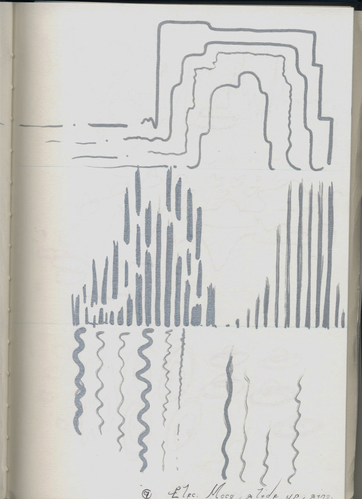

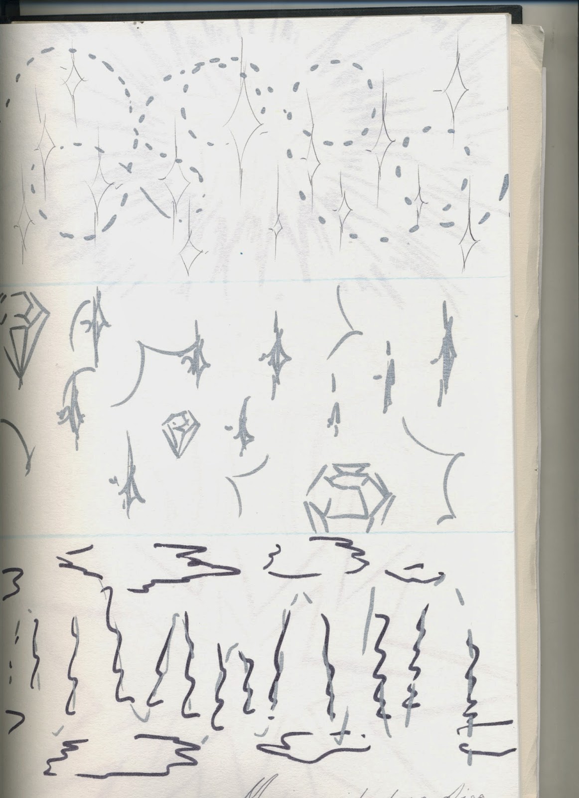

In order to make sure we could create great animations based on the sounds we had listen to and had chosen, we had to experiment a fair bit so that we could understand what worked, what didn't, why it did and didn't work, how to compose a sound within a set space, the size of the sound influenced by volume and texture, density and so forth. Here are a series of my experiments (there are more in my portfolio) that I have scanned in. I chose ten sounds from a potential thirty and had a play around with them.
Tuesday, 18 March 2014
OUAN404 - Visual Language, Sketchbooks
OUAN404 - On The Importance of Sketchbooks:
As a rule of thumb, I try and give myself at least one hour a week to get down some drawings in my sketchbooks of ideas that have been building up in my mind that I simply need to release. Every day I see things that inspire, mostly in an emotional way, that I feel relate to me somehow. Due to this, I need to let out that emotion somehow and usually drawing and sketching helps to do that. Getting those emotions out in one big burst of work is cathartic and relieves tension for the next day to come. It's therapeutic and allows the mind some freedom to think of things outside of the workplace/college.
During the module, I have done many, many sketches of which have been influenced by plenty of things. I never usually draw when I'm angry I've discovered, as I cannot be calm and focus on the work, this needs to be released physically. When happy or sad however, drawing helps immensely to record that. I did this frequently as a child and was often called into the Headmaster's office to explain why I'd drawn something disturbing, now I look back at laugh that at the age of 6, I was just as strange and open minded then. So, less of the rambling, here are a few cathartic moments that relate specifically to me and have helped get me through the course of the year...
The doll was to indicate many of the fears and anxieties I'd had over the year, and although a bomb or a spider might not mean anything to the audience, nothing is really ever as it seems. To me, it's a completely different object. The struggles with money, family and death are all recorded somewhere in my work and they're usually really subtle. There's the struggle with workload and adjusting to a new life, learning life all over again and meeting new people. The happiness of having a new life, and the feeling of emptiness that came with it was also prominent. The feeling of caring for others when they needed it most. I feel that art shouldn't just be a pretty picture, it has to come from the heart and if you struggle to show emotion like myself, drawing gets that out of your system...
OUAN404 - Visual Language, Flow, Form and Force, Life Drawing Animations 3
OUAN404 - Flow, Form and Force:
How could I go an entire module without mentioning Disney? Well, here's the Disney fix as I ran completely out of other animations that featured some form of reference to life drawing. I would've much rather talked about something else, but then I discovered that Disney are actually an appropriate example as they often used real life examples of actors and actresses (not being entirely politically correct here, but hey ho) posing for specific parts of the corresponding animation. For example, for Sleeping Beauty, (old but gold!) the actors would dress up in as accurate costumes as possible to the characters' in order to show how clothes gather and crease at certain joints, how fabric drops and flows depending on weight and structure, and how certain items being held affected the way a joint or limb moved due to weight and form.
Disney really thought hard in many of their films on how to be as realistic and psychically accurate to real life as they could, despite the wacky storylines and obvious takes on Grimm's tales... Anyway, I feel that using reference as detailed and well thought as this is a good way to help with the process of animating and is by far not a means of cheating as if you were to simply guess how a fabric moved or a limb swished in a particular way, you may make mistakes that cannot be easily rectified. Using reference is a good way of learning as the more you draw, the better you remember and if a certain pose or material or weather condition and so forth (the list is endless) is worked with for long enough, it becomes drilled in your mind and eventually the process will be quicker and easier.

OUAN404 - Visual Language, Flow, Form and Force, Life Drawing Animations 2
OUAN404 - Flow, Form and Force:
After scouring the internet for suitable uses of figure drawing in animation, I couldn't find anything that compared with Thought of You. However, I did realise that animation shouldn't just be limited to film and TV as this highly annoys me when animation is considered to be restricted to those categories. So, again, video games play a huge role in animation and require a suitable knowledge of character design and figure drawing in order to be well informed and successful. Bayonetta being one of those video games that has an obvious of life drawing...
Bayonetta herself is very lean, long and flowing in terms of movement. The essence of being seductive and a temptress is shown off very well in her movement and body language. I like that character isn't all about the way someone looks or behaves with the use of characteristic and personality traits. It's nice to see character coming through heavily in movement and the way a character walks is a crucial part of giving them appeal and strengthening their personality. Bayonetta was created with the purpose of being seductive eye-candy with an edgy bad-ass personality. This comes through in the way she struts, moves her hips and places one foot in front of the other when walking (which after lots of research is how most women walk when trying to be sexy...) which instantly brings out her personality. The way she swings her hair and flicks her hands around shows confidence. Lots of reference material must have been needed to create her as Bayonetta's movement is so precise and detailed, even down to the way she snaps her fingers or waves at the camera moving every individual finger in a swaying motion to look attractive and alluring.
These very soft, often subtle movements and gestures are what makes up a character and gives them life. Curves are very prominent in Bayonetta's physical appearance but every movement she makes is either a swoop or an arc, or a sharp, linear movement. This indicates two sides to her personality. Platinum Games have thought about this very well.
OUAN404 - Visual Language, Flow, Form and Force
OUAN404 - Flow, Form and Force:
I had immense fun drawing people from our class in life drawing sessions. I feel it's a vital part of being an animator that we should explore different poses on a daily basis and learn how to draw from different angles, perspectives and also through spaces. We were asked to capture the essence of motion through a series of drawings of our peers or other models in order to improve our life drawing skills and to understand how a character can move through a space and creating a particular emotion or character personality. For instance, we had a go at creating jolly and bouncy movements and capturing those in short bursts of time using a range of different media.
After trying different poses, time lengths and media, I decided that my favourite media for capturing flowing, soft movement was watercolours, inks and brush tip markers. Wet media gave that essence of fluidity and had a really nice aesthetic to it. For sharper, angry or abrupt movement, pencil, charcoal or graphite felt nice and fitting. For heavy, manly, boisterous or dragging movement, thick lines worked best and chiseled tip markers seemed to capture that. I learned a lot whilst doing this activity and felt that I improved slowly as the drawings went on. I would love to do this again sometime!
OUAN404 - Visual Language, You Spin Me Right Round
OUAN404 - You Spin Me Right Round:
I came across this brief with a level head and good enough idea as to what the purpose of this activity was. Of course, I'm very keen on character design and thought it would be a suitable way to benefit my skills by trying to draw a very well loved doll of mine from a 360 degree perspective. Drawing twelve drawings was easy enough, but getting all the proportions right and making sure it spun smoothly without any obvious problems was quite a challenge. All in all, the entire thing took me around 6 hours. 4 hours was primarily spent drawing, 1 hour on photographing for reference just in case my doll moved a little bit (his body parts were detachable and the joints weren't very reliable as they slid around a lot), and the other final hour on editing in Potatoshop and getting the whole thing fixed and ready to go!
I made a couple of correctable mistakes when undertaking this task. The first was pivot point. In fact, a lot of struggled with this as some of our chosen objects had strange possible pivot points that could look natural. Any part of the doll could've been a pivot point, but I chose the head as his legs leaned slightly outwards making him look like he was riding one of those fairground rides with those swings that spin outwards! It didn't look too disturbing in comparison to the other mistake: big black marker pen lines! That always seems to get me and I need to learn not to do this in fits of panic! Whenever I feel a drawing doesn't look quite right or the lines aren't that thick or strong enough, I panic and go into overdrive creating the weirdest looking lines that probably has a thickness of 5/6 points. It's not attractive and looks silly. I would like to rectify that and get out of that habit in the future.
OUAN404 - Visual Language, Spaces and Places: Environmental Animations 3
OUAN404 - Environmental Animations:
Now, although I may have mentioned anime before what lengths some go to in order to get that sense of "epic" in their environments to compensate for the unrealistic style of the characters, I feel that not only in film animation does this work and make a successful animation, but in video games this works too. More so as you are able to interact most of the time with the environment and feel that you are there. You are able to almost become one with the scenery opposed to simply sitting on your couch watching some poor soul explore a dark cave which has hardly enough impact on your emotions in comparison to video games.
Tales of Symphonia, (yes, by far one of my favourite games if you haven't gathered already!) has a wonderful use of setting and style. In this trailer for the very first ToS game ever to be released (which was released in Japan in 2003, Europe 2004), you'll see that not only were the graphics pretty impressive for an early 2000's RPG, but the environments are beautifully done with the hand-painted style I mentioned in earlier blog posts.
OUAN404 - Visual Language, Spaces and Places: Environmental Animations 2
OUAN404 - Environmental Animations:
Although very popular and probably an obvious choice, Studio Ghibli is a brilliant example of how environments are drawn in animation successfully. I looked at Spirited Away as a more specific example and I find that the scenery is really attractive and well thought out in terms of angles, space and point of view. You find that with some animation, the angles are very linear and flat as not a lot of experimentation has been made as more focus goes on the characters and storyline. I prefer an equal amount of attention to be given to environment as if it is well set and beautifully drawn, it can set the emotion and feel of the scene instantly without having to show a single character's face to give away the atmosphere.
Environment is the first thing you should see in an animation and should pay close attention to it as it primarily sets the scene and allows you understand a little about time period, place and feel. Spirited Away has influences from traditional Japanese architecture (seems appropriate as Miyazaki is of course Japanese and would pay homage to his country), as well as some European. In general, Ghibli films such as Kiki's Delivery Service and Howl's Moving Castle is very European in terms of setting as influences from French and English culture is heavily thrown in. The music usually also helps define this, but the scenery solidifies those suspicions.
The environments in Ghibli films are very traditional looking, hand-painted-anime-style and realistic. I like this look and feel it is successful as the characters often look so unrealistic that placing them in a very real and detailed scene with every window on every building delicately drawn and highlighted to perfection makes up for the loss in reality in the characters. It brings back what often some anime lacks - epic environments! Lush, green, rolling hills and sweeping clouds and winds help to give some emotion to the piece through realism, where the characters do that through unrealistic exaggeration.
OUAN404 - Visual Language, Flow, Form and Force, Life Drawing Animations 1
OUAN404 - Flow, Form and Force:
A good few months ago, a fellow Animation student showed us a beautiful piece of work by a very talented man named Ryan Woodward. He created "Thought of You" in remembrance of his wife when she was away from him and he couldn't be with her. This animation actually made me cry a little because I'm an emotional wreck at times when something so amazing pops up out of the blue. I relate very heavily to this animation and it was ever so sweet that this was a tribute to the person that meant the most to him. I often go back and watch it as it's very comforting.
In terms of how it relates to the brief and not just Grace moaning about how she's a blubbering mess when watching this, I absolutely adore the way he draws his characters in such a soft and delicate way. He really thinks about flow, form and force and the animation itself is full of fluidity. I really aspire to make something as heart-stopping as this as not only does the soundtrack get you, but the way he captures figure and movement with such simple detail is astounding. He does not have to give the characters facial features or specific clothing to give them personality and appeal, the way they move with one another and work together creates that emotion and character instantly. It's full of passion and that's why it works!
I then watched the "Making of Thought of You" and learned how Ryan Woodward made this astonishing animation! It took over 20,000 individual drawings on what looks like Adobe Flash. He had over 20 different layers for something that looks so simple in the make-up of the characters. The backbone, hair, feathers, every different part had a layer and took a lot of hard work, choreography and emotion to make this.
Thursday, 13 March 2014
OUAN404 - Visual Language, Spaces and Places: Environmental Animations 1
OUAN404 - Environmental Animations:
The Lloyds TSB adverts are a wonderful example of how environment is used to tell a story through animation. These animations focus heavily on scenery and is often very realistic and appealing in the sense that very warm colours are used, soft textures and lots of lighting and shadows give it a very authentic look and feel.
I personally think the Lloyds TSB adverts are amazing! They're very precise and detailed and the scenery is astounding as every leaf and every brick is full of life and imagination. There was obviously an incredible amount of thought and love put into the creation of these adverts. The animations themselves are very spacious as the composition of the scenery along with where the characters are placed in the environment are very precise and well thought out. When watching the adverts, you don't get a sense of being "cramped" or uncomfortable as the format is obviously widescreen 16:9, but the composition in that space works and is not too overcrowded.
http://www.youtube.com/watch?v=M8LLL9E4dyQ
http://www.youtube.com/watch?v=-rnrgajoxYc
OUAN404 - Visual Language: Spaces and Places
OUAN404 - Spaces and Places:
The first two places I chose were outdoor as I mentioned earlier. I technically chose three outdoor as I did a couple of extra drawings of my aunt's garden in Skelmersdale (a small town just off Liverpool which isn't really much to look at but gives that raw, gritty feel of a run-down town). My main outdoor places were Knaresborough river and Liverpool city centre. I did various drawings of my aunt's plants in the garden, her Buddhism mural and sculptures, water fountain and stone tiling. All of which had magnificent colours that even stood out in winter as they were just so beautiful. My aunt is very precise and logical about colour scheme and loves lots of oranges, browns and creamy colours.
Liverpool city centre was a lot less colourful but was a lot more interesting as I had the opportunity to draw the big wheel (ferris wheel), radio tower and some other various bits of scenery. Knaresborough river is very close to my hometown, Harrogate. It was only a bus rise away and has always been one of my favourite places as it it just so beautiful and peaceful. You could sit there a whole day and draw without an ounce of bother from anyone. The river itself looked great in watercolours, but it was very time consuming to paint every detail, so pencil sketches had to make do for some examples. The third place I drew was actually the inside of current flat. Now, it may not be the best choice but actually I wanted to draw my flat as it has sharp corners and very harsh lines in comparison to my other choices which were very curvy and soft.
OUAN404 - Visual Language: Spaces and Places
OUAN404 - Spaces and Places:
Over the Christmas holidays when I had a fair bit of time to explore some interesting places, I decided to visit my family in Liverpool as they would often take me to the city centre and museums and plenty of interesting places in hope that I would take photographs and draw from them and use them as inspiration for future work.
The brief we were set, "Spaces and Places" meant that we had to visit at least three different places and draw 5 observational drawings from them. We had to take into account perspective (I like drawing from unusual or challenging perspectives and angles as you can never have enough practice and it gives the work a little more oomph in comparison to simple straight on or side views), colour, texture, media and line. We were also persuaded not to go any smaller than A4. I found that working on A3 was quite nice as although it was more time consuming, I prefer to work larger and it gave me that freedom to use my elbow, wrist, hand and shoulder when drawing which gives a completely different feel to sketch rather than working on A4 and just being restricted to using your hand.
I chose 2 outdoor spaces and one indoor. I don't do much outdoor work so I felt that this would help me with environmental composition and drawing as opposed my usual character design work. I want to explore and learn as much about every aspect of design as possible. I do not want to restricted to characters as I feel that in order to specialise in one area of animation, you need to have vast knowledge and experience in all areas beforehand.
OUAN404 - Visual Language: Observe, Explore and Consider
OUAN404 - Observe, Explore and Consider:
Although we were asked to document and record the world around us, which personally I have great difficulty doing as most of the ideas I get pop up from nowhere or are at least inspired by the world, but end up looking nothing like what I was inspired by, I decided to try my best to at least find the time to do some sketchbook work. You can see some of my work on my PPP blog as I find it hard finding the time to upload photos of my work.
Mostly, I draw characters that friends have asked me to do or something has inspired me to make a character etc. Sometimes I'll create scenery, buildings, creatures and so forth. It's difficult finding the time with so much work going on and still trying to fit in what mere social life I have at this point.
However, I think that making time for at least one drawing a week is good as if you stop drawing, you do eventually lose your skill and so many of my family members who wanted to pursue art as a career simply couldn't because they never had time to improve upon those skills. Bit of an odd blog post, but in my humble opinion, sketchbook time is me time, and me time is good time...
OUAN404 - Visual Language: Observe, Explore and Consider
OUAN404 - Observe, Explore and Consider:
We have been encouraged to have an ongoing use of our sketchbooks throughout the year as drawing leisurely is a crucial part in discovering new styles, techniques, mark making and ideas. We are constantly involved and inspired in the world around us and the more we see and do, the more we need to draw and record all our thoughts and emotions from what we encounter on a daily basis.
Through using my sketchbook, computer, sticky notes and any other scrap of material I can get my pencil-covered paws on, I have been able to understand format a lot better over the course of year. Format was a very difficult part of animation for me to understand as although the concept is very simple, I could not get my head around the whole 16:9 format thingymajig! Eventually, after much practice in my sketchbook and using my laptop and Photoshop and so forth, I was able to grasp a better understanding and can now draw a rough 16:9 frame guide easily and quickly without having to measure out every inch/centimetre.
From being small, probably because of influence from childhood technology, I have been used to working 4:3. Obviously, times have changed and I still need to get with the whole widescreen concept. I not only now understand why it is a better format choice, I see why it works in technology as a whole. 16:9 allows you to see everything easily unlike 4:3 where the picture feels restricted and squashed. 16:9 gives a sense of freedom and in a sense helps you feel part of whatever you're watching.
OUAN404 - Visual Language: Set, Series, Sequence
OUAN404 - Set, Series, Sequence:
Much experimentation was done in my 32 images regarding media. I flitted backwards and forwards between what media I would use for my 12 image storyboard. Then I decided that coffee and tea on torn, burned paper would look amazing! I had a little play with the media to see if it was suitable for the story I was trying to tell. I settled on using to hairy-legged style of spider with lots of fuzz and hair texture. I wanted a cutesy look to my spiders without being too cartoony. I opted for a spider that had more that two eyes as this seemed logical and looked quite funny too!
The story was based in Victorian Britain in a gloomy London street lit by paraffin street lamps and surrounded by rats and all other forms of dirt and grime. The first scene took place outside a sewer grate where a little male spider resided in a soup can. I later found out that soup cans hadn't been invented until the 1900s, so I felt a little silly after creating this. However, I have learned that when creating something historical-based, you must do your research! I will know this in future and not make the same daft mistake!
Mr Spider is all alone in his little world of a soup can when he decides to climb out to find some food. Just by chance, a female spider falls from a nearby street lamp into the grate below where Mr Spider immediately tries to save her from falling to her death. They both become good friends and live together in the grate below. He is no longer alone, happy ending, cliché, whoop-de-doo. I wanted to convey that although spiders might be terrifying to people, they probably have intricate and complex lives just like us and deserve to live as much as any other human does. By adding an element of lovability into the story by making the spiders adorable and silly-looking, it might help humans relate a little more to the way they treat their eight-legged home inhabitants.
I then developed a short poem to narrate the storyboard. All in all, I am very proud of this piece of work and think it looks pretty interesting as the coffee and tea really gave it that Victorian, sepia feel to it.
OUAN404 - Visual Language: Set, Series, Sequence
OUAN404 - Set, Series, Sequence:
Following on from my eight images, I attempted to create a short animation of a spider's daily life. It featured a little spider sitting on a bowl of fruit then suddenly he discovers a female spider on the edge of the table directly below him. Their eyes glisten and wobble as they get excited to see each other and immediately fall in love. The camera flashes backwards and forwards between their eyes, zooming in further and further until you're completely captivated in the moment when BAM! A huge fly swat comes down on the lady spider completely shattering the moment. It was only an experiment and didn't turn out great anyway. I did this animation in a traditional style with a thick, black marker and paper. The marker didn't give a nice line and smudged often anyway. I just wanted to try something with my images to see if I could grab a few final straws of inspiration. I gave up on the animation and decided not to scan it in.
I then decided it would probably be better if I went on to do some form of storyboard (which was part of the study task anyway) based off my eight images. I still held onto the idea of a spider's life though. Although this time I could incorporate some more texture and different uses of media and paper. I hated the same old boring "black marker on white paper" trap that I always fell into...
OUAN404 - Visual Language: Set, Series, Sequence
OUAN404 - Set, Series, Sequence:
After managing to get all 32 of my ideas for "spider" down on paper, I played about with the texture, line, mark and various other features of some of them. I began to understand that it's not all about what a spider is or what it looks like, it's about what a spider feels like, smells like, sounds like, and, to some extent... What it tastes like? Yuck. Nevertheless, I enjoyed the task a lot more when I discovered a whole new way of recording ideas. It didn't have to be fully understandable or make much sense, the ideas didn't have to look like masterpieces. I found certain marks that "felt" nice and looked aesthetically pleasing as well as giving a nice "warm" and "fuzzy" tingle when you looked at them.
The way a spider's legs feel. Thos sharp, coarse hairs that line their legs or the soft, fluffy down you get on their bodies. The shape of their legs, the wetness of their eyes. Yes, I was getting too carried away with this but it was great and I enjoyed it! I then went onto create eight more images based on image that I liked out of my 32. I slightly bent the rules as I was attached to a few of them. The textures of one, the art style and appeal of the character on another, and the lines and thickness of the other. I combined what I liked about these to create eight images about a spider's daily life.
OUAN405 - Visual Language: Responding to Sound 3
OUAN404 - Analysing Sound:
Following on from synesthesia, I looked at how some other practitioners animated sound. As a whole, I understood from being a child that visualising sound played a huge part in the way I watched cartoons and read comics. The stereotypical "boom" and "bang" onomatopoeias were shown as large, spiky, fire-coloured star-bubble-things! Speed lines and little clouds of dust depicted the sharp, high-pitched sound of a character running at great speed suddenly from being in a static position. I understood a lot about stereotypical sound animation, but not how other, more experimental animators showed sound.
I looked at Kevin Franz on YouTube, an experimental animator whose short animation often left you thinking "what?" and questioning why on Earth he chose to do such things in his shorts. The work I looked at was "The Sound of Animation" and "The Sound of Animation 2". Although I found them to good little pieces of 3D animation featuring little black balls with stripes on them turning into all sorts of weird shapes to different sounds, I felt that they weren't exactly what I was looking for. They were too perfect and not surreal and experimentational enough for my liking.
http://www.youtube.com/watch?v=4UrVzFYAbjU
http://www.youtube.com/watch?v=kDN5latsqzY
OUAN404 - Visual Language: Responding to Sound 2
OUAN404 - Analysing Sound:
Upon learning to draw sound, I looked at many different techniques and methods that could be used to actually get what I was hearing down onto the paper/computer. I found actually animating sound significantly easier than simply drawing still sound. I think this is because I imagined sound to be moving, even though it doesn't necessarily have to be animated to great lengths.
I watched this brilliant little animation called "Synaesthesia" by Nikko Hull on Vimeo. http://vimeo.com/36252713 I found this interesting as it was an account of a character's daily life living with synesthesia, a medical condition that affects the way you percieve sound. It is a blending of the senses and is often seen as "seeing sound", making it confusing at times to distinguish what you're seeing and what someone with this condition is seeing.
The character is portrayed in a range of situations; sitting in the park listening to dogs bark, babies cry and various other everyday noises. Cubes of yellow and red depict different noises. Their sizes change depending on the volume of the sound, and I wanted to portray how the size of a sound when draw relates to volume. All in all, it was very interesting to watch and gave me a few pointers on how synesthesia works and how it can be used to an advantage when creating drawings of sound and eventually animating them.
Thursday, 6 March 2014
OUAN404 - Visual Language: Responding to Sound
OUAN404 - Analysing Sound:
After completing the sound tasks where I created five short animations of the sounds I had chosen to animate, draw and observe, I looked at a few animations that I considered to be a good use of sound. I looked at how they visualise sound and how it is represented, the form, shape and flow of it and how the space on the frame is used to show how big or small a sound is.
Firstly, I looked at an obviously popular example: Disney's Fantasia. I looked at this as although it is not as abstract as some of the other examples we have looked at in terms of what is shown on screen, I felt that what Disney had done was very creative in terms of how the characters responded to the sound. A live orchestra actually played along to this and really had to feel the music and be the music in order to play something spontaneous yet representative of the animation. The mood changed really well in the music, going from minor to major accordingly depending on the colours, textures, timing and expressions of the characters. Blues and darker, more muted tones in the animation often resulted in a very mellow, slow and dreary melody being played by the orchestra. Bright and chirpy and animation and colour resulted in the opposite in terms of music.
OUAN406: A Tale in The Sting: Cutout Testing
OUAN406 - Testing:
Recently, Cassie and I from the animation group both decided to kill many birds with one stone by doing our testing together in order to see what techniques worked the best when we were animating by stop motion. We wanted to check for a few vital things: would the paper/card slide off the background too easily thus needing some form of adhesive or background with more friction, and would the card bend and tear easily as I cut the pieces out using scissors instead of a scalpel which would give a smoother and cleaner cut?
We spent a good four hours in the mezzanine trying to come to terms with the equipment (rostrum and camera, Dragonframe and old Mac) and then finally getting a practice six seconds worth of footage. We played about with subtle movements, doubling up on frames, facial expressions, blinking, twitching and the animals moving off the frame. I certainly had fun and saw this method to be successful and fun and would like to use this for my ident. However, I need to test a few other methods (I plan to try out Adobe After Effects to see if there's a difference in overall feel and whether I prefer it or not).
Monday, 3 March 2014
OUAN406: A Tale in The Sting: Character Cutouts Cbeebies Testing
OUAN406 - Testing:
In relation to my Cbeebies character designs, I have recently printed them out on matte card with a thickness of 300gsm. I contemplated using shiny card but the lamps from the rostrum would be too bright and the light would bounce off heavily and look incredibly shoddy in the final shots. The matte would work well as the light would not reflect horribly off my characters. The colour would be flat and even in comparison to any other card.
I have yet to acquire a background for my ident though I was thinking of dark green as the grass would be light green thus allowing the characters to stand out. To stop the characters from slipping when doing my stop motion, fuzzy felt would be appropriate, but I was considering trying methods such as blue tack, double sided tape and just plain paper to begin with to see what works.
Subscribe to:
Comments (Atom)