Sunday, 28 December 2014

OUAN504 - Character & Narrative - Acting Up: Understanding 3D Modelling (Insight Into Polys)

OUAN504 - Understanding 3D Modelling:

Polygons, or polys for short, are the pieces that make up a 3D model. They are the shapes that play the important role of the model's foundations and are stitched to each other by vertices and edges in order to make up the final product.

But what exactly does it mean to have a set poly count limit when it comes to professionally creating models for clients? Why do high poly counts mean slower rendering and loading times? I went on a little hunt to find out more about the polygons that make up a 3D animator's life.

This image from Fallingpixel.com is an easy way of demonstrating the difference between low-poly and high-poly models. You can see that the model with a higher count of polygons has an increased level of detail. Lower counts often look blocky and are better used for models that don't have much screen time in an animation or aren't to include much interaction in a game.


If you can find the balance between a good-looking model and a low enough poly count, then it will make matters much easier if importing into other software such as Unity as most programs have a poly limit of some description for each model or set. The image below by Matt Coombe shows that sometimes you don't need to overcomplicate things as with a poly count of 6,707, you can still create a model that looks utterly brilliant and will work much better too. Personally, I prefer the model on the left with the lower poly count as it doesn't seem too "smooth" and "perfected". In fact, there are very few minor differences between the two aesthetically, whereas the difference in polygons is astounding!


OUAN504 - Character & Narrative - Acting Up: Understanding 3D Modelling (A Brief Look into Lighting)

OUAN504 - Understanding 3D Modelling:

It may be all well and good creating a fantastic looking model, but without proper lighting, a multitude of sins can stick out like a sore thumb! I thought it would be interesting to research popular tools and methods used to give subtle light to environments for a more realistic look, harsher lights, and so forth.

To begin, Radiosity, an illumination algorithm, is an addition to many of the render methods that exist in 3D modelling and animation. Unlike various other methods (Mental Ray and Raytrace are another couple of lighting algorithms), Radiosity is slightly unconventional in some respects as it doesn't focus on the usual method of "reflection of light ray>directly to an object>eye". It is based around the more natural idea that a ray from a light source will reflect on many objects and then back to the eye, thus allowing a mix of colours depending on the colours of the light source and the objects. This is particularly useful when lighting interior environments as walls and other multiple rooms may not be in the direct path of a light source, so it will heavily rely on the reflections from other objects. Although from Wikipedia, here is an image perfectly depicting the use of Radiosity with a comparison against another more unnatural lighting technique.  Radiosity uses GI (Global Illumination) which is a way of following natural light behaviour i.e. casting rays by following realistic rules. Many renderers use GI.


Many people's opinions on internet forums seem to sway more towards Mental Ray as the choice for rendering and lighting as apparently it is more predictable. Some have argued that it is all a matter of personal preference and that the only way to truly decide on the best renderer is to try them all and do tests. I personally think that it is important to test out as many methods as you can in order to have a valuable opinion on what works for you. As a student, we have only been given Mental Ray as the renderer of choice - possibly because it is reliable - and I do wish to play with many more to get an idea of what they all do.

Mental Ray has a feature called caustics which allows a ray of light to say for instance, shine onto a wall in a room and then reflect the light onto other surfaces. "A Look At Caustics" by Jeremy Birn - http://www.3drender.com/light/caustics.html - is a very helpful guide on how caustics work in animation. Below is an image from his article showing a side by side comparison on how a rendered image looks with and without caustics to enhance lighting properties. 


A Raytraced image (Left) and Raytrace enhanced with caustics (Right)


OUAN504 - Character & Narrative - Acting Up: Understanding 3D Modelling (Concepts, Principles & Limitations)

OUAN504 - Understanding 3D Modelling:

A Short History of Rendering

Way back when, early 3D models consisted of wireframe shapes that were simple representations of the everyday geometric shapes we know today. The beautifully rendered shapes and models we are able to create in this age started out with hidden algorithms. These began in the 1970's and allowed us to render curved surfaces as well as non-spherical objects.

In 1978, a wonderful gentleman named Jim Blinn who started out working for NASA creating computer graphics and animation for such things as the Voyager project. He went on to do a "simulation of wrinkled surfaces" - collgran.wordpress.com.  There is a shader named after him in Maya, this is probably why as he such an influence over 3D animation.

I wish to go on with the historical aspect of rendering and 3D animation, however, it would be more practical to look at some of issues I have come across when using 3D software and certain limitations I have experiences even though I touched on them in a previous post.

Experienced Limitations

Although I haven't been using 3D software for very long and have a huge way to go in order to at least get some sense from using it, I still believe that everyone's experiences are different and we all encounter different problems.

I find that when it comes to physically creating a model or character, it is incredibly complex to use textures with them that aren't the shaders (Blinn, Lambert etc.) as creating your own textures is a completely different skillset entirely and is baffling!

Poly count. Even though we haven't got round to creating insanely complex environments or characters just yet, I have noticed that when modelling smaller environments (grassy fields with mountainous rocks in the background for instance), if the poly count is high, it can take a good while to load up and even render. There has to be a compromise between quality of model and poly count as larger poly counts can mean in-game crashing if to be used for such purpose and long loading times.

The size of the files created when using 3D modelling is immense and can often lead to issues with inadequate computer space or processors. Not all animators are wealthy and having to fork out on the latest in computer hardware can be a bit of a setback.

OUAN504 - Character & Narrative - Acting Up: Understanding 3D Modelling (Tomb Raider - Evolution & Motion Capture)

OUAN504 - Understand 3D Modelling:

In terms of how far 3D animation has come as a process, I think it would only be fair and logical to talk about how the popular Tomb Raider games franchise has improved over the years. I remember playing one of the first Tomb Raider games when I was a toddler, and although being a toddler I couldn't make comment on the technologies of the time, I did think it was an amazing game as I simply couldn't put it down!

Tomb Raider has had a lot of stick though due to feminists screaming "exploitation". Though this hasn't (thankfully) affected the way Lara Croft has been developed as a character. This little gem was found on the website Fanpop (see image below) showing the fantastic evolution of Lara Croft over the past couple of decades since it was first released on Playstation One in 1996. I think it is phenomenal to show the changes she has undergone.


The new Lara looks much more realistic and conforms to a more natural-looking female body shape in comparison to the 90's Laras with breathtakingly thin waists and exaggerated proportions. The advance in 3D technologies is very obvious in this image and has allowed for better clothing texturing, lighting, smoothness and complexity of body shapes, and many other features. This isn't just a feature of the Tomb Raider franchise however. I plan to explore the growth of design and modelling within other animation later on in my blog.

Lara Croft's animation today is undergone using the performance capture method. Early techniques of motion capture (performance capture) were done using many cameras in order to calculate the object or person's positions within a space. There are various advantages that come with using motion capture. Some of these are as follows:

Rapid, real-time results can be accurately captured.
Traditional techniques such as 2D or stop-motion can vary in intensity of work and complexity.
Secondary animation, exaggeration, and subtle movements can be easily caught.

In contrast, the disadvantages are:

Expensive to acquire suitable software and hardware.
Specifications in order to use hardware and software vary such as capture space etc.
Unnatural movement is hard to replicate as you cannot really tamper with captured movement.
Added emphasis and unnatural movement (linear/robotic/overexaggerated) is easier to achieve with other methods.

I am actually very thankful that Lara's chest is no longer triangular in shape as it may have given men unrealistic expectations of what women should strive to look like. Thank technological evolution for allowance of more polys and better software! (Apologies.)


OUAN504 - Character & Narrative: Modelling Props (The Stars)

OUAN504 - Modelling Props:

For the very last scene of my animation, Moom is shown spinning around amongst falling stars whilst holding a T-pose. It is supposed to look like he is revelling in the falling stars and enjoying the fact that he is an "all star". I wanted to make the stars look very unrealistic and basic. I looked at many images of different types and shapes of stars and after playing a little "reference gaming", I stumbled upon some brilliant stars that would be very fitting for the animation.

In fact, I was playing the Playstation One game "Stuart Little" and saw the stars floating around in one of the bedrooms. They were bright, cheerful, very slightly 3D (the stars are only to be seen from the front view so making them too complex would be pointless), and had little shadow on them.

After creating a prism shape, I pulled in some of the vertices to give it the five-pointed star shape and puffed out some of the faces and vertices to give depth. I added some lighting to see how the light would fall and how the shadows would be cast and was very happy with results. I didn't want them too dramatic as it might detract the attention from Moom.


OUAN504 - Character & Narrative: Modelling Props (The Onion)

OUAN504 - Modelling Props:

Despite me thinking my modelling was alright for an amateur, this character in particular really threw me off guard. The onion, the character of which Moom is seen interacting with during the first scene or so wasn't exactly a demonstration of my "improving" Maya skillset. Not only did I find it hard to model, but texturing was unbelievably difficult!

The shape of the onion and the cute expression reminded me of a mob from an online game I played back in the day called Fiesta. The mob (group of monsters of which you played against) was a group of things called Slimes. I thought my onion vaguely resembled one of these. (Image below)


Or maybe even the Slimes from Dragon Quest?


I used a simple image of a licence-free onion found on Google to use for the texture as I wanted to show the streakiness of the onion's layers. I did try a simple Lambert texture and used a vague onion-like colour, but without the added detail of the onion skin and many layers underneath, it looked more like a brown excrement than an onion...

However, the face of the onion went better than expected and I still achieved the "gormlessly cute" and vacant look of which I was after. So despite the horrid onion shape (I watched many tutorials and studied other 3D onion models without prevail), I managed to model at least something. I may try again if I have time as I can't possibly make the same mistakes twice (hopefully).


Tuesday, 16 December 2014

OUAN504 - Character & Narrative: Modelling Props (The Basketball)

OUAN504 - Modelling Props:

This was incredibly difficult at first despite it being a mere basketball. The reason for this was that I didn't want to apply any more images onto my models as textures as I thought they were starting to look a little shabby and without decent knowledge of texture application, I decided that it was best to stick to good old Lambert and Blinn by applying simple shaders.

This meant that rather than creating a simple ball and making it orange with black lines, I had to create the grooves on the ball by using a few tools that I had never touched before. A useful tutorial on YouTube (below) was a great method of learning this new tool of which was not available on the toolbar so instead I had to manually type the name of the tool into the command bar to select it. This tool was the "Interactive Split Tool" which allowed me to get the grooves on the basketball into a rough position on the ball. After smoothing the ball, they fell into shape.


After finishing this model, I agreed it was by far the easiest I had made. Here is my finished product.


OUAN504 - Character & Narrative: Modelling Props (The Axe)

OUAN504 - Modelling Props:

To add to the comical notion of the animation, I decided to model an axe as it fits perfectly with the lyrics ("ain't the sharpest tool in the shed" could have connotations of pitchforks, spades, and other various garden tools). However, I decided to take it a step further and turn my everyday, obvious axe into a video game-style war axe used for slaying enemies! This would work much better than a regular wood-cutting axe as the onion (of which I still have to model) is depicted looking at the axe in horror. So, a little exaggeration on the type of axe will work a treat!

Using reference once again from Google (and a couple of great tutorials on how to use boolean difference), I found an image of a war axe that I thought was easy enough to model and looked the part.


After a horrible experience with lighting and texturing this model, I think I need to get more practice in so that I can light and texture with more confidence. The first image shows how the texture didn't quite fit, and sadly I thought I could away with it. However, after pondering over this for about an hour, I realised that something had to be done. So I went into photoshop and shoved a grey background in just to fill the rest of the axe shape. This quite frankly looks worse but will benefit the animation more than leaving big blank gaps of textureless axe everywhere...

Oh well, I gave it my best shot. Modelling this was incredibly fun, though!

OUAN504 - Character & Narrative: Modelling Props (The Guitar)

OUAN504 - Modelling Props:

After a good few weeks of focusing on other modules, I have decided that it is maybe a wise idea to start modelling my props for the Moom animation as it is scheduled on my planning sheet to make a good start round about now. This will probably take a good week if I do this properly and get some good practice in animation alongside modelling the props.

My first task was a guitar for Moom. I used a simple image plane as a basis of reference to model from. I could then look at this image in order to guide me when creating shapes. I then used the same image of the guitar to create a UV texture and apply it onto the model. I admit, it looks terrible, but I have gained valuable skills in applying textures to my models and will hopefully this technique over the years. I am thoroughly enjoying model-making (not so much the animation side however!) and hope to continue 3D modelling in the future and as a hobby.

Here are some shots of my guitar. I admit that the texture wasn't fabulous and it was a rather lazy way of applying the texture to my model (applied image to model which meant it was duplicated or rather wrapped around the back showing the same image from the front on the back also!), however it was the quickest and most appropriate thing to do as in my animation, you won't see the back of the guitar of which Moom will be holding.


OUAN504 - Character & Narrative: Maya for Dummies (That Means Me!)

OUAN504 - Maya for Dummies:

As part of the course, Maya is a mandatory part of the learning process and getting to grips with this beast of a program isn't an easy task. For any stuck little minds out there sat at their desks sporting faces full of puzzled looks, here's a nifty list of the fascinating and possibly life-saving things I've learned if having a crisis in Maya. I plan to keep a note of all problems and how they were fixed be it through my own (unlikely) intellect, or through that of my tutors.

Problem One - Mental Ray has Disappeared!

According to Google, the source of wonderful help forums, you should go to Window > Rendering Editors > Render Settings and check if Mental Ray is actually present to select. If not, which was the reason why I was confused, you should then go to Window > Settings/Preferences > Plug-In Manager, checking for a thing called "mayatomr.mll ". This should be checked in order to have Mental Ray present.

Problem Two - Can't Get Back to Neutral Character Pose!

Yes, we've all done it. Playing around with Moom for too long can only entail issues where body parts go flying, end up at the other side of the planet, or worse; missing. In order to get your character back to the original pose he was created in, select all of your character, then press "O" on the keyboard for a T-Pose, or the neutral position.

Problem Three - Can't get Front View?

Simple. View the four view perspectives and click in the one you want to enlarge and view as your single view, then hit spacebar to enter that view. Done!

Problem Four - Struggling to grab all of Moom's body?

Select the little circular disc on the floor around Moom's feet and press up on the keyboard. This will select everything meaning he won't lose eyes and hands in the process!


Wednesday, 3 December 2014

OUAN503 - Responsive - Individual Practice: Rewriting A Brief

OUAN503 - Rewriting A Brief:

BA (Hons) Animation - Level 05
OUAN503 Responsive - Studio Brief 1

BRIEF TITLE Taylor’s Coffee Syrup Packaging

Brief

To create a product (syrup) range for Taylors of Harrogate focusing on 3 package designs. Possibly extend this by developing the designs into a short animation.


Product
Tone of Voice

3 product designs
20-30 second animation


Sophisticated
Fun
Professional

Audience
Context

16-25 year old students of whom are not massive fans of regular coffee


To be suitable for television (consider title safe guidelines and rulers to avoid text and images being clipped off the screen)

To fit a suitable bottle type (research label sizes)

Additional information/Considerations

Consider style of animation (graphic, cartoon, painted, abstract, realistic, 3D, 2D, traditional)
Colour theory (Taylors already use complimentary colours, so sticking with this might be useful)
Programs to use when creating the animation (Maya, Flash, After Effects, Photoshop)
Flavours of the coffee syrup (conduct a short survey/questionnaire on demographic)


Mandatory Requirements
Deliverables

Product designs
Use of Taylors logo
300 word evaluation on product

Product designs
Animation


OUAN503 - Responsive - Individual Practice: SMART

OUAN503 - SMART:

As a guideline for creating successful project proposals, we were given a short lecture on the best methods of doing so. I found these very helpful and allowed me a better understanding on rewriting a brief to suit my project needs. You should always consider the original brief and use key words from it such as mandatory requirements and such.

BA (Hons) Animation - Level 05

OUAN503 Responsive

STUDIO BRIEF 1 - Indiviudal Practice

Project Proposals
10 steps to producing persuasive project proposals


  1. Set clear aims and objectives

  1. Be SMART

( Specific , Measurable , Achievable , Realistic , Time Conscious)

  1. Use words from your brief

  1. Justify the need for your proposal

  1. Describe your audience

  1. Describe your motivations

  1. Consider the reader

  1. Eliminate vagueness

  1. Visualise the ending  

  1. Assume nothing

Monday, 1 December 2014

OUAN504 - Character & Narrative: Sound Recording

OUAN504 - Sound Recording:

After finally taking the time to book out the sound recording booth, I spent a good hour or so practicing different variants of my lines in a range of accents to compare which ones worked best with the narrative. I recorded a good dozen takes and after listening to them all one by one and picking out the positives and negatives of each recording, I decided on my final choice for the sound.

I noticed that some of my recordings were incredibly fast-paced and I discovered that I needed to slow my voice down. By acting out the movement that Moom would make, I was able to slow my voice down a little bit and be a little more "theatrical" in my performance. I managed to get a little bit of emphasis into my voice and portray as much emotion as I could manage.

It's quite difficult to perform when you have all these wonderful ideas in your head that come out at a million miles an hour in a rather monotonous voice, not making any sense when you listen to them back and quite possibly all being in the wrong order. I much prefer typing to speaking as you can correct everything! Despite the harsh learning curve, I then edited the sound slightly as I wanted to achieve a very low-pitched voice to go with the terrible excuse for a Scottish accent.

I did this in Adobe Audition and only slightly lowered the pitch I then exported this as both an MP3 and WAV file so that I could use both in any instance. (WAV files are compatible with Maya which was the intention for recording in the first place.)


Wednesday, 26 November 2014

OUAN503 - Responsive - Individual Practice: Taylor's of Harrogate Audience Analysis

OUAN503 - Audience Analysis:

Putting together a board of ideas on what the target audience would be like was a genuinely helpful idea as it allowed me to become a member (which, in one respect I am!) of the audience, think like the audience, and have an understanding of their lives and what would make my product successful and appealing to them.

Indeed, I am a 16-25 year old who doesn't enjoy coffee and wish there were ways of me being able to. Of course, the only way I can enjoy coffee is by taking away that bitter taste, thus using coffee syrup. If I can get this message across to others in my age range, Taylor's may indeed get it's products across to a new audience, not it's usual 35+ audience.

16-25 year olds are most likely going to be students. They're going to want to socialise and enjoy being with friends. They will like creativity, fun, and novelty. Novelty in the sense that a Christmas exclusive range would be of interest. Students enjoy design, the aesthetics of a product. If a product looks good, they're more likely to pick it up. However, Taylor's is a well known and reputable brand which also works in its favour, so quality will also be a key factor (of which Taylor's takes pride in). It is accessible. The average student cannot afford nor be that bothered to travel to independant coffee specialist retailers such as Whittard's of Chelsea every month to pick up their coffee products. Especially so if they do not have interest in trying coffee in the first place.

The average student shops at supermarkets - affordable, easy, everything is in one place. A student like myself is more likely to try something new such as coffee products if I spot them on my weekly shop. If I have no interest in coffee in the first place, I will not travel to a specialist retailer, so supermarkets are a good way to advertise to an audience that may not have thought about buying a particular product.

The student type will have a busy lifestyle, though most would like to unwind after a long day studying with a hot drink. Although the party and nightclub scene is still prominent among this age, students will still need downtime to relax. Having friends over for tea and coffee is a perfect way of promoting the product. I have often had friends ask me where I got my syrup from as they spot the luxury, prized bottle in a prominent place in the kitchen.


OUAN503 - Responsive - Individual Practice: Taylor's of Harrogate Product Idea Inspiration

OUAN503 - Product Inspiration:

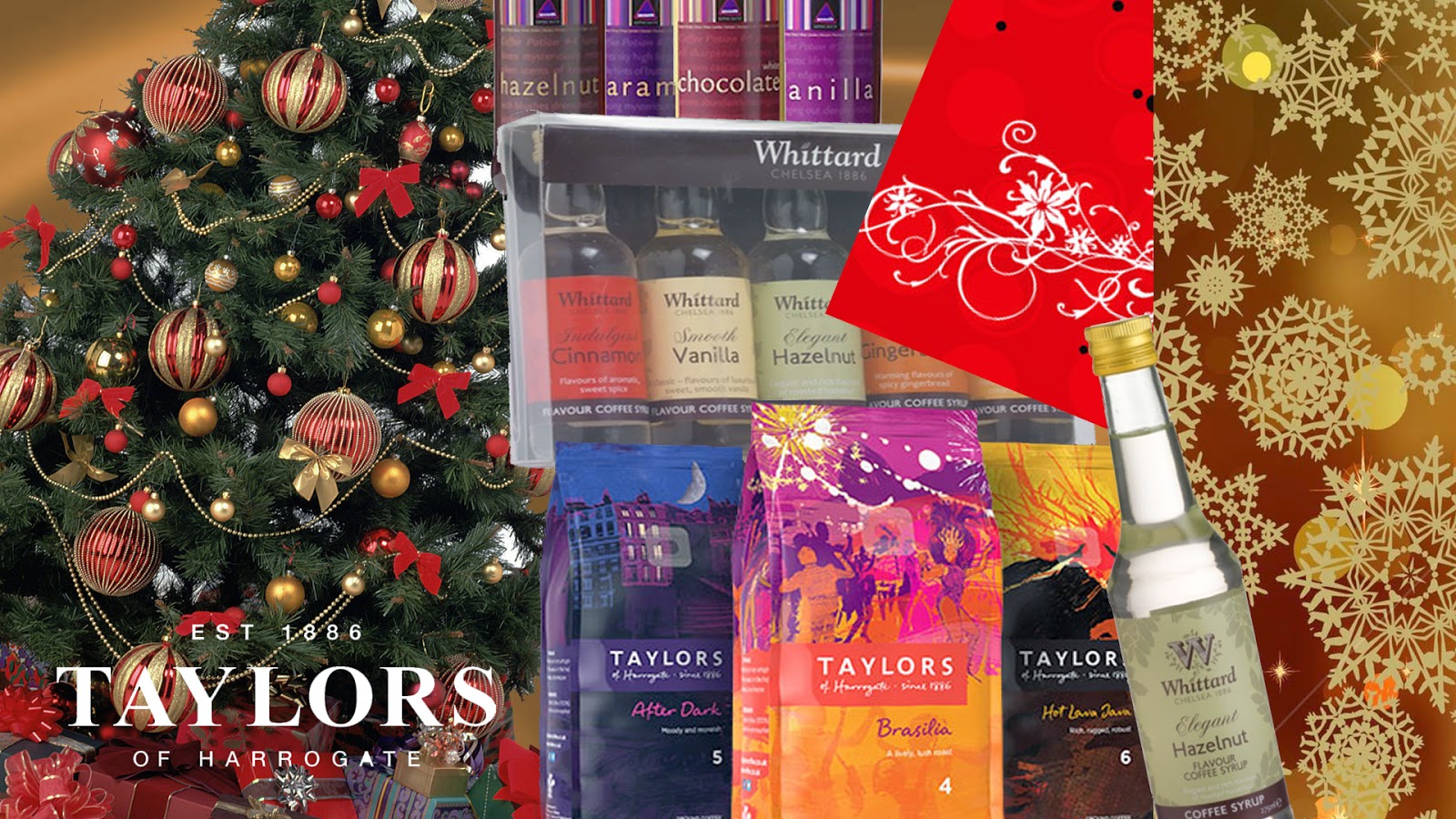
For my presentation tomorrow, to clearly let everyone know what I set out to accomplish for this brief, I decided to put together a sort of mood board containing images of which I have inspired by. As I mentioned earlier in my blog, I set out to make a new innovative product for Taylor's that encouraged a younger audience to start enjoying coffee.

I also aimed to make this product accessible to the younger demographic. Taylor's of Harrogate's produce is already incredibly accessible as most of it's products are sold in most supermarkets nationwide. I planned to come up with a range of flavoured coffee syrups of which aren't that accessible in most stores that 16-25 year olds would visit for their weekly shop. I visited many supermarkets throughout Leeds as part of my research and trekked the stores in pursuit of coffee syrups - I found none.

Taylor's would be the perfect company to start marketing this on a larger scale as in my personal opinion, coffee syrups are almost like a gateway "drug" into the coffee world and by starting with something sweet, a younger audience may then be tempted to try coffee without the need to add syrups.


Just by looking at this mood board, I already feel like it's Christmas. It gives the illusion of warmth, smoothness, and sumptuous, luxury coffee. Although coffee syrups have already been done before by plenty of companies, I feel like there's a market for a Christmas selection. The brief will also allow me to create a short animated advertisement of which I already have a few ideas for.

Tuesday, 25 November 2014

OUAN503 - Responsive - Individual Practice: Taylor's of Harrogate Question Sheet

OUAN503 - Question Sheet:

In order to have a thorough understanding of the brief and the audience, I filled in this sheet containing important questions about my chosen brief. I will present these on Thursday to the class in order to demonstrate my knowledge of the problems I must solve and so forth.


Friday, 14 November 2014

OUAN504 - Character & Narrative - Study Task 4: What A Dope

OUAN504 - What A Dope:

In order to correctly map out mouth movements and facial expressions, we had to fill out "dope sheets" that enabled us to plan out the animation, staying in time with the sound we had chosen for our animations. Dope sheets are a completely new concept for me, even though I have actually done similar processes in the past as part of pre production. I think they are very effective and will work nicely for me as I have a bad habit of "just going with it" and hoping for the best when it comes to lip syncing.

I will use Maya to import one of the sounds we were given so that I can see the frame on which certain phonemes will need to be expressed by Moom. We will be working at twelve frames per second to make the process easier and to allow us to get used to this method of pre production. I believe that dope sheets will keep me more organised and I would like to use them more often in as many modules as possible as it will certainly save time in the long run.


Tuesday, 11 November 2014

OUAN504 - Character & Narrative - Study Task 3: Strike A Pose (Posing Moom)

OUAN504 - Strike A Pose:

As part of Strike A Pose (Study Task 3), we were asked to pose Moom in the same positions as the ones we had taken photos of ourselves doing. The aim was to be able to practice with Moom and understand how he worked, as well as learning about how our own bodies work and how we must pay attention to detail as certain things such as pressure on joints must be taken into account when posing characters.

I spent a good few hours playing around with Moom, trying to get him into some form of acceptable pose that looked vaguely like the ones I had previously done to represent the five chosen emotions. I went for ones that could be exaggerated in an over-the-top fashion, and ones that could be exaggerated with subtlety so that it would be more of challenge for me. Here are my finished Mooms. I do plan to get some more practice in before my Acting Up sequence as some of my poses could easily be improved.

Anxiety


 Confusion


 Exhaustion


 Fear


 Shame


Monday, 10 November 2014

OUAN504 - Character & Narrative: Interim Crit Feedback

OUAN504 - Interim Crit:

Despite feeling that my presentation was lacking a little something and having that doubt in the pit of my stomach that everyone else had done so much more work than I, I believe I performed as well as I could - even if I talked a bit too much, which usually happens during my presentations! I got some valuable feedback and was able to leave my crit feeling like I knew exactly what to do next which is always a bonus,

Some of my class members agreed that the scenes where Moom is receiving a prop (axe, guitar), he should catch it from the left and throw it out on the right to add in some more movement and to save the scene from looking to boring and without enough action. Beforehand, Moom would catch and throw always to the left. I'm glad I got this advice as it will save my animation from looking too repetitive and give me the opportunity to twist Moom's body a little body and bring out his hyperactive, cheerful character!

Aside from that, everyone seemed in agreeance that I was on the right track, which is good news as I had no clue and felt a little lost to be honest! I'll keep going with my research, try and book a soundbooth at some point to record some voices and make a decision on what I'll use, and finally get study task three done. I am enjoying this module more than I thought I would and wish to get the best grade possible, despite my efforts sometimes hindering me and getting me in a pickle (indecisiveness!).

OUAN503 - Responsive - Individual Practice: Taylor's of Harrogate


OUAN503 - The Brief:


Taylors Coffee

Engage younger customers with a new product innovation for Taylors Coffee

Background

Britain is fast becoming a nation of coffee drinkers. The rise of the big coffee chains followed by the independent coffee shop explosion continues to attract new consumers while methods of preparing great coffee at home have become more accessible.


The UK retail coffee market is a complex one with many different sub categories:


• Roast and ground typically using a cafetière or filter is in market decline

• Pod/Capsule market is the area of the market in strongest growth currently

• Micro grind or whole bean instant coffee continues to grow its share of the category

• Standard instant continues to be a part of many drinkers daily repertoire

• Beans (for consumers grinding their own coffee) is relatively flat


About the Audience


From an age perspective, the current Taylors audience is 35+. This brief is about the future of coffee drinking and as a result we’d like the focus to be entirely on the 16-25 year old demographic.


About the Brand


Taylors of Harrogate has been producing outstanding tea and coffee since 1886. As the number one filter cafetière brand, our promise is to deliver mind-blowingly good coffee. We follow our six guiding principles in everything we do:


• Prosperity – remain an independent family business


• People – value all stakeholders and reward them fairly


• Product – provide exceptional quality, customer service and value


• Processes – ensure precision and attention to detail


• Planet – our environmental approach goes beyond just good practice


•Passion – deep love and belief in what we do is at the heart of our business


The Creative Challenge


Create a new coffee product innovation for Taylors of Harrogate.


We’re looking for revolutionary ideas that can really shake up the coffee category. This should be a drink, preferably hot, and should avoid instant coffee and anything requiring the purchase of an electric machine to make it – i.e Pods/Capsules. Think about trends for this younger audience, where you could see the market going and how it will appeal whilst still fitting in with our brand values. What could be fashionable or desirable for 16-25 year olds in this space that isn’t currently out there?


It’s worth looking into the progression of coffee, often described as ‘waves’ or ‘generations’ to see how we’ve moved from very basic instant to embracing origin and new taste profiles. For the purposes of this brief, what could the fourth or fifth wave look like for this audience?


Essential things to bear in mind


We’re looking for a creative product idea. You should explore packaging, format, occasion and usage. This is not a communication or campaign brief. The output here should be Product Innovation.


This isn’t about licensing or partnering with brands in other categories. This should be a coffee product that delivers extremely good coffee that Taylors are known for.


As well as bringing your idea to life visually in as much detail as possible, please also provide a written summary of it in less than 300 words.


Deliverables and Additional Information


For guidance on how to submit your work, please adhere to the main Deliverables information which can be found at the YCN website.


Any additional information referenced in the brief can be found in the supporting Project Pack at the YCN website.

OUAN503 - Responsive - Individual Practice: Rethinking A Brief (Taylor's of Harrogate)

OUAN503 - A New Brief:

After scavenging YCN's freshly served briefs, I finally found two of which I was very fond of in terms of possible outcomes and opportunities. The Taylor's of Harrogate, and the Yorkshire Tea briefs were both of interest to me. However, the one that I went for was Taylor's Coffee as it is more specific in what it wants from you, the brief was clearer, and I found it overall more appealing.

I don't drink coffee personally, so you could argue that the Yorkshire Tea brief would have been more suitable as it is more relatable. I disagree with this as the reason why I, a member of the target audience they want to address this at, don't drink coffee is that it is too bitter and boring. There are many different tastes and varieties of tea (there are with coffees, too), whereas coffee will almost always taste bitter. This could be the reason why a lot of 16-25 year olds don't drink it, it's not as enjoyable and seen as a more "on the go" kind of drink, in comparison to tea; a more social, relaxing drink.

In order to tackle this, I came up with various ideas in order to entice young adults into drinking coffee. The idea of tea being relaxing and social should be a feature that coffee needs to compete with. I thought about this and how young people like variety, creativity, and choice with drinks. This led me to this conclusion: Taylor's of Harrogate have become so successful and popular nationwide and even globally, that their stock has reached supermarkets far and wide. With this in mind, they have the ability to put my product out there and reach a new audience on a massive scale.

Being from Harrogate myself, I walk past Taylor's warehouse on a regular basis (I grew up with Taylor's on my doorstep) and my stepdad, who works for them as a coffee and tea blender, gets to see first hand what new products are being developed. This could be valuable to me, as using him as a first hand insight into what the company might like as he sees packaging and products literally everyday, I could pass my designs and ideas through him and get his feedback as if he were talking on behalf of them. He knows what sells the best and why, so maybe it's worth using this to my advantage.

Whittard's of Chelsea, a company that also specials in tea and coffee, but is not so heard of, created products a while back that enabled the customer to flavour their teas and coffees with syrups. These came in a few flavours and although not hugely spoken about, they are fantastic! I currently have a bottle of coffee syrup in my kitchen and I can assure you, friends of around my age love it. This persuades them to give coffee a go, and is almost a gateway into the coffee-lovers world!

This in mind, Taylor's have the ability to get this product out there to be seen in supermarkets and make it more accessible. This is something that no other company has done so overtly as these products are usually sold in specialist shops, like Whittard's. I was thinking that maybe a Christmas range of flavours could be created, each with their own designs, but still following the theme of Taylor's products - classy, sophisticated and aesthetically pleasing.

OUAN503 - Responsive - Individual Practice: Rethinking A Brief

OUAN503 - Rethinking Another Brief...

Due to my own clumsiness (it often gets me in these situations!), I may have accidentally chosen a brief from 2013/2014 from YCN instead of a 2014/2015 one. Now, although this isn't entirely a bad thing despite being looked at in shame by the rest of the class, I reckon it has given me a valuable head start as now I can analyse another brief - from the list of valid ones this time!

So, despite that little hiccup I will now choose another brief. There's nothing to say I couldn't participate in the Cath Kidston brief, I will just be unable to submit it. It may be some worthwhile practice at responding to a brief though. I could even set myself a deadline within challenging reason in order to get some practice in!

Never mind, let this be a learning curve...

Thursday, 6 November 2014

OUAN503 - Responsive - Individual Practice: Ohh Deer Progress

OUAN503 - Progress:

In terms of the Ohh Deer competition, there are ten days left until the deadline. I have uploaded three out of four possible designs, though I wish I could practice a little bit more to get the perfect final cushion. Ten days is a lot of time to get the last design done though, so I'm quite proud that I've managed my time well. My last design features some watercolour painted budgerigars. I have yet to finish this and get it uploaded.


OUAN503 - Responsive - Individual Practice: Study Task 1: What's The Problem?

OUAN503 - What's The Problem?

Cath Kidston

1) What problems can you spot?

Well, Cath Kidston certainly seems to be a popular brand, so should be able to fork out for a swanky graphic designer or illustrator to do the job instead of asking the nation's students. Maybe they're not as well off as they seem...

2) What is the brief asking me to do?

The brief is asking for one new creative print in three different colourways. It is asking for a tiled version and a stepped out version, using no more than a maximum of twelve different colours. This doesn't seem a huge task, a fairly simple brief in fact.

3) What can I achieve? 

I can achieve a new understanding of the company and why it is so popular. I will also achieve knowledge of print-making, something which I feel is vital as I may need this skill in the future for other briefs/work. Achieving an understanding of how to cater for the target audience is also mandatory.

4) What message is the brief trying to convey?

Well, for one the brief is trying to persuade you to actually take part. They must be desperate if they're holding a student-directed competition. It is trying to convey simplicity by being fairly "to the point" by stating clearly what they're after. They start the brief by talking about nostalgia, what happened in the past and what they aim for in the future. This optimistic approach draws you in and makes you feel welcomed, Cath Kidston needs you!

They're also quite relaxed and colloquial in the way they talk. "Think a man in his underwear", "bits and bobs". This makes you feel more relaxed - they're professional, but not too uptight.

5) What is the target audience?

The target audience seems to be the metropolitan woman who wants modern-vintage designs to brighten up her day. She has the stress of looking after the kids, the house, the husband, and needs some cheerful patterns in her life to express the fun-loving woman she really is. She could also be the happy-go-lucky student who has a love for all things colourful and vintage-styled.

She loves making things, festivals, car boots, and vintage shopping. She watches reality TV, loves going out, and has the idea of moving to the countryside one day. She is the British woman.

(Aged roughly 18-30?)

6) How is the message delivered?

The message is delivered very much like I spoke about above: very down to Earth and cheerful. It isn't frightening or intimidating to read, and doesn't ask too much of you. It's fun and flighty, pretty representative of their designs really!

7) Who will benefit from this? Myself or the company? Both?

I'm betting that Cath Kidston will get more from this than myself as if you win, you are presumably awarded with a little bit of fame on the websites (YCN and Cath Kidston), a meal out at an event to celebrate your win, and that's it. However, they as a company get your designs, are allowed to brand them in their name and make money off them. Doesn't seem too fair now, does it?

8) Can I foresee any problems?

Yes. My lack of print-making is one problem, but this can be overcome with some research and practice as can any skill-based issue. I can see the problem of a possible mass of other competitors as so many students will see this brief and because of the popularity, it might be the obvious brief to go for. However, not many animators would go for this I presume, so I'm in with a chance of being the not-so-obvious choice, thought they are after a print and nothing else, so no animation for me I'm afraid...

OUAN503 - Responsive - Individual Practice: Study Task 1: What's The Problem?

OUAN503 - What's the Problem?

Taylor's of Harrogate

1) What problems can you spot?

I can spot the problem that the target audience might not be interested in customising their coffee if they do not like coffee in the first place. They may think that a product to enhance their coffee experience is useless to them as they have not been persuaded by coffee products before. There is also a market for coffee syrups already so this range would really have to stand out to be unique and successful.

2) What is the brief asking me to do?

Create a product that would encourage a younger audience to try Taylor's coffee. This could be a design for a product or an actual physical product.

3) What can I achieve? 

Given my skillset and current knowledge, a psychical product might be too difficult so a design would be suitable on its own. Within the time limit I will be able to test out a range of designs and them maybe narrow it down to three of four final outcomes.

4) What message is the brief trying to convey?

Sophistication, luxury, consumerism. Basically Taylor's want the target audience to buy a new product so that it hooks them into the coffee-drinking world and pumps them of their cash. They want to do this in a way that makes the audience feel worthy and exclusive and that the product ha been specifically made for them, enticing them to buy it.

5) What is the target audience?

18-25 year old demographic. Probably the student-type who enjoy a relatively positive social life but who wish to wind down after a long day of studying with friends and customise their coffee.

6) How is the message delivered?

The message is delivered in  way that seduces the audience into believing they're the sole reason for this product's creation, not the fact that money might be a huge part of it. The consumer of great importance, they must try this new innovative product.

7) Who will benefit from this? Myself or the company? Both?

Myself in terms of knowledge, experience, and learning new skills. The company will benefit hugely if they ever did miraculously use my work in some form or another as they would profit to a great extent and I would not gain a single penny to my name.

8) Can I foresee any problems?

I can see the problem of myself becoming bored with the project as I do happen to drift from one brief to another as longer briefs can be quite tedious. I can also see that my product design skills are not that great and a lot of research into labels, sizing and so forth will need to be thorough.

OUAN503 - Responsive - Individual Practice: Study Task 1: What's The Problem?

OUAN503 - What's the Problem?

J20

1) What problems can you spot?

I can imagine that plenty of adults who wish not to drink alcohol, and even ones that do and still enjoy J20 might not really care about what the packaging looks like as it is the content that is important. The audience might find it a little bit patronising that the bottle has to be completely redesigned simply to make them feel better.

2) What is the brief asking me to do?

Recreate the product label to suit an adult audience.

3) What can I achieve? 

I can create the labels digitally and print them physically with some research and experience. With the time set available, a good ten or so designs can be created with the final design chosen and redrawn with elements from all the successful labels.

4) What message is the brief trying to convey?

The brief is trying to convey maturity and professionalism in a way that will suit the target audience. It wishes to persuade adults to drink J20 by leaving that 'kiddie' feel behind and taking on a new approach and personality.

5) What is the target audience?

Adults, 25-35 year old men and women "who love getting together with their friends and family, both in and out of home. They are grown up, confident, have an established social network, and feel relaxed with those around them. They don’t need alcohol to boost their confidence or lower their inhibitions and are happy to interchange between alcohol and soft drinks."

6) How is the message delivered?

The message is delivered easily and to the point. The brief makes it obvious what it wants from me and is easy to work with. It has set me a task that is accomplishable and achievable within the time limit.

7) Who will benefit from this? Myself or the company? Both?

Myself in terms of skills learned and where I can go with those skills in the future. The company will benefit more in financial ways if they ever decided to use any of my designs.

8) Can I foresee any problems?

Lots of other students may wish to choose this brief as they know the product and are probably familiar with what they're aiming for. Graphic designers and illustrators may go for this more than animators so their is the chance of an animated outcome but it is not asked for. Lots of entries means lots of competition so hat could be an issue.


Tuesday, 4 November 2014

OUAN504 - Character & Narrative - Acting Up: Storyboards

OUAN504 - Storyboards:

Here a few rather shoddy scans of my storyboard. I initially had a series of thumbnails and decided that it would be best to get them into a logical order with staging and shot choice involved. I might want to work on clarity in the future as I usually only make my storyboards of any sense to me, when in future, other people might need to read them!


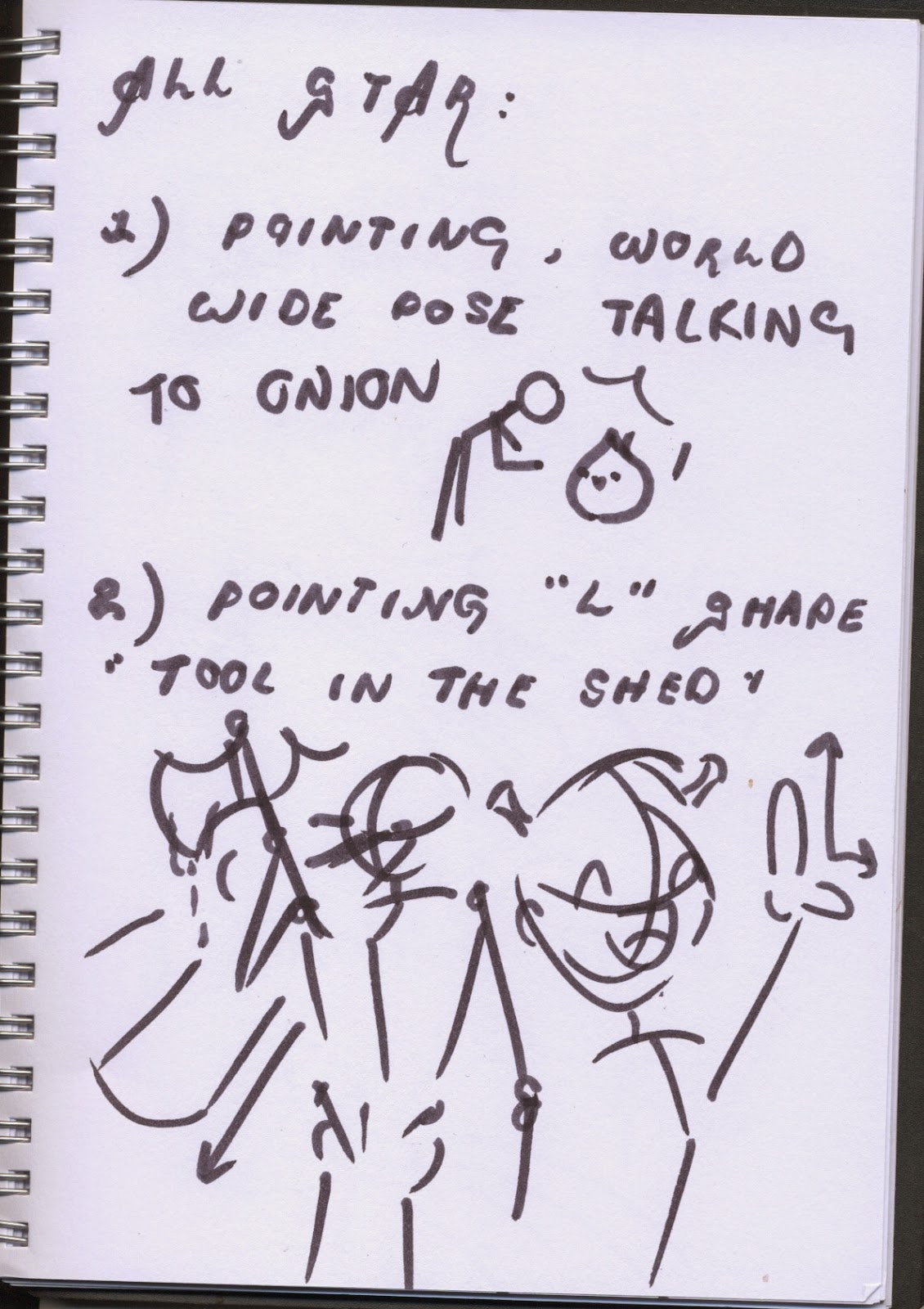
Moom points to Onion as if in the midst of teaching him a lesson. Wide shot of Moom and Onion so that the scene is set and an idea of space is given. When the corresponding line is heard, an axe is thrown to Moom from the left. Onion looks startled.


Axe will be thrown off to left again and as appropriate line comes, Moom will make an "L" shape on his forehead to indicate "loser" sign. Quick zoom in to close up of Moom pulling dopey grin with "L" shape on head. (Thoughts about cutting this out to save time.)


In short silent moment when no sound is heard ready to anticipate the beginning of the chorus, in a split second, Moom kicks Onion off the screen very abruptly. Snap to scene of Moom close up as he is ready to catch the basketball for corresponding line.


Moom pushes the ball towards the viewer as scene quickly snaps to mid shot of Moom getting ready to catch a guitar from the left when correct line is heard from the audio.


Moom plays the guitar for a couple of seconds .


After the Interim Crit, feedback was given that it would look better and give more variation if Moom then threw the guitar off to the right instead of the left as the Onion is no longer there to get in the way. It would also aid in making the animation less repetitive. "All that glitters is gold" is a cue for a quick swap to the next scene in which a series of stars fall slowly and Moom makes a T-pose as if trying to catch the stars whilst spinning around happily.


"Only shooting stars break the mould" then becomes the last shot of a cheeky wink and finger snap with a slight zoom in slowly. The End.

Friday, 31 October 2014

OUAN504 - Character & Narrative - Acting Up: Thumbnailing & Initial Poses

OUAN504 - Initial Poses:


To start off with getting some ideas down for Character and Narrative, I began by sketching out some initial poses. These thumbnails make it easier to get a storyboard together, thus allowing me to have some form of reference instead of just going in for the kill, creating a storyboard from thin air, without any proof of concept. Thumbnails are a great way of jotting ideas down in a way that makes sense to you.


After my thumbnails, I thought about how many props I would need for Moom to interact with. There are five in total, listed below. There will be roughly one for each major pose/scene. I will watch some tutorials in order to help me model these as I'm certain they will be a challenge. I aim to create at least two a week, though that might be a bit difficult with other modules going on. 

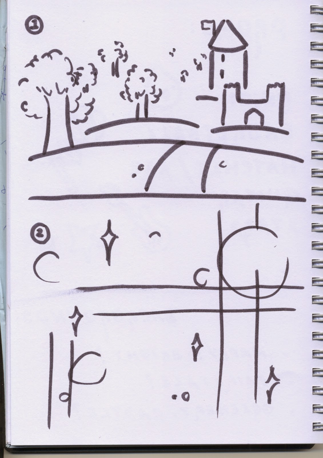
Not many people have put much thought into backgrounds as far as I know, so I thought maybe it was time to start thinking about potential backgrounds. A fairytale scenario would be ideal as the song is featured on Shrek and I wish to give Moom some ogre ears to accompany the song lyrics.

I could always reuse my bokeh/sparkle background from my E4 Kawaii Girl ident created last year as pink and green would go nicely together.

Blog Archive